Antigravity 2.0 IDE Feature Entry Optimization: UI Update Resolves User Confusion Over Missing Functionality

Antigravity team fixes IDE entry visibility issue and resets user quotas as compensation
Antigravity 2.0 users mistakenly believed the IDE feature had been removed, when in reality the interface redesign had made the entry point insufficiently visible. The team relocated the IDE entry to a highly visible upper-right position and reset all users' weekly usage quotas as compensation, while encouraging continued user feedback. The incident highlights the critical importance of core feature discoverability during product redesigns.
Event Overview
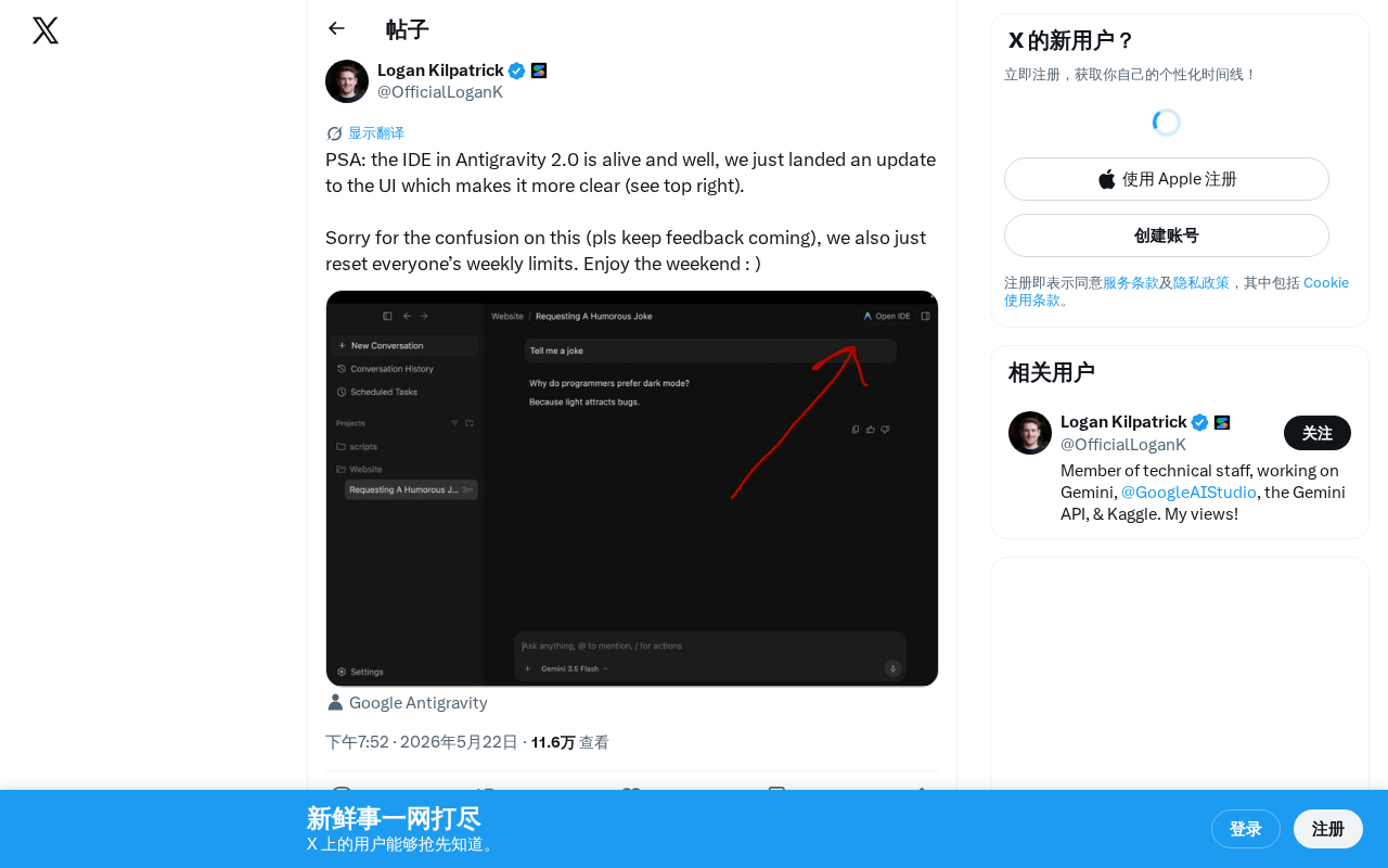
The Antigravity team recently issued an announcement via social media to clarify user concerns about the status of the IDE feature in their 2.0 release. The team confirmed that the IDE feature has been functioning normally all along and has pushed a UI update to make the feature's entry point more clearly visible (located in the upper-right corner of the interface).
UI Update Details: From "Disappeared" to "Prominent"
Problem Background
Judging from the wording of the announcement, many users had mistakenly believed that the IDE feature in Antigravity 2.0 had been removed or taken offline. This confusion likely stemmed from the 2.0 interface redesign, where the IDE entry point lacked sufficient visual hierarchy, making it difficult for users to locate the feature.
This is a classic product discoverability problem—the feature itself is fully intact, but if users can't find it, it's effectively "nonexistent" from an experience standpoint. Discoverability is one of the core concepts in user experience design, systematically articulated by interaction design pioneer Don Norman in The Design of Everyday Things. It refers to whether users can naturally discover the features and operations a product offers without external guidance. According to research by the Nielsen Norman Group, approximately 60% of users abandon a feature not because the feature itself is flawed, but because they simply don't know it exists or can't find its entry point. In the AI tools space, this problem is even more pronounced due to rapid product iteration, frequent interface changes, and users' mental models often failing to keep pace with product evolution.
About Antigravity's Product Positioning
Antigravity is an AI-assisted tool designed for developers, with one of its core selling points being a built-in IDE (Integrated Development Environment) that allows users to complete the entire workflow of code writing, debugging, and AI-assisted development within a single platform. The importance of an IDE as a developer's core productivity tool goes without saying—it's not merely a code editor but a comprehensive development platform integrating syntax highlighting, code completion, version control, debugger, and more. In the current fiercely competitive AI coding assistant landscape (with products like Cursor, Windsurf, and GitHub Copilot all vying for dominance), the usability and accessibility of IDE features directly impact user retention and product competitiveness.
Solution
The team adjusted the UI layout to place the IDE feature's entry point in a more prominent position in the upper-right corner of the interface, ensuring users can intuitively discover and use this core feature. The upper-right corner is a high-frequency area in users' visual scanning patterns, making this adjustment effective at improving feature visibility.
This layout choice is backed by solid design research. Through extensive eye-tracking experiments, the Nielsen Norman Group found that users typically follow F-shaped or Z-shaped scanning patterns when browsing interfaces. In the Z-pattern, the user's gaze starts from the upper-left corner, scans horizontally to the upper-right corner, then moves diagonally to the lower-left corner, and finally scans horizontally to the lower-right corner. This means the upper-right corner is the second natural landing point for users' eyes, making it a prime location for important feature entry points. Many mainstream applications (such as GitHub's code editor entry and VS Code's extension button) place high-frequency operations in the upper-right area—a design paradigm that has been widely validated.
User Experience Compensation: Resetting Weekly Usage Quotas
Beyond the UI improvements, the Antigravity team also simultaneously reset all users' weekly usage quotas, effectively granting users an extra week's worth of usage. This measure serves both as compensation for the prior confusion and demonstrates the team's commitment to valuing user feedback.
In the SaaS and AI tools space, usage quotas are a common component of business models, typically calculated on a weekly or monthly basis to control API call counts, content generation volumes, or computational resource consumption. Resetting quotas as a compensation mechanism has well-established precedents in the industry: OpenAI has extended subscription periods for paid users after service outages, and Notion AI has granted extra usage credits to users following feature malfunctions. The advantage of this compensation strategy lies in its controllable cost (low marginal cost), high perceived value for users, and its ability to directly incentivize users to re-engage with the product, creating a positive feedback loop. Compared to hard compensations like refunds, quota resets are more effective at restoring user activity levels.
The team explicitly stated in their announcement "pls keep feedback coming," demonstrating an open attitude toward product iteration. For a rapidly evolving AI development tool, maintaining close communication with the user community is crucial.
Product Design Takeaways: Core Feature Visibility Cannot Be Overlooked
This incident provides a valuable lesson for product teams: during major version updates, the visibility of core features should not be diminished due to design changes. Even if a feature is fully intact, if users can't find it, it's effectively "gone" from a user experience perspective.
The industry has developed systematic validation methodologies for this. Common verification methods include: task completion rate testing (having test users complete specific tasks without guidance), first-click testing (observing users' first action when facing a new interface), A/B testing (comparing feature usage rates between old and new layouts), and heatmap analysis (tracking users' click and gaze distribution across the interface). Google's HEART framework (Happiness, Engagement, Adoption, Retention, Task success) provides a systematic approach to measuring user experience, with the Task success dimension directly relating to feature accessibility. Many teams neglect these verification steps after redesigns, causing "disappearing feature" problems like Antigravity's to recur repeatedly.
The Antigravity team's rapid response—from identifying the problem to pushing a fix to resetting quotas as user compensation—demonstrates the crisis management cadence expected of a mature product team. This also serves as a reminder to all teams undertaking product redesigns: after every major overhaul, always verify that core feature paths remain clear and accessible.
Key Takeaways
- Antigravity 2.0's IDE feature has been functioning normally all along; user confusion stemmed from a UI design issue
- The team pushed a UI update moving the IDE entry point to a more prominent position in the upper-right corner (aligned with the high-frequency landing point of Z-pattern visual scanning)
- All users' weekly usage quotas have been reset as compensation (a common industry strategy with low cost but high perceived value)
- The team encourages users to continue providing feedback, reflecting an open iterative approach
- After product redesigns, teams should verify core feature path accessibility through task completion rate testing, heatmap analysis, and other methods
Related articles
 Product Reviews
Qoder vs Cursor Real-World Comparison: Which $20/Month AI IDE Is Better?
Hands-on comparison of Qoder vs Cursor AI IDEs: Agent autonomy, human interaction count, and architecture decisions. Qoder needed only 2 interactions vs Cursor's 8.
 Product Reviews
Cursor Cloud Agent Demo: Eliminating Bottlenecks Across the Entire Software Development Lifecycle
Deep analysis of Cursor's Cloud Agent demo showing how cloud VMs, automated test artifacts, and a full-chain control plane systematically eliminate human bottlenecks across the software development lifecycle.
 Product Reviews
Cursor 3.0 Deep Dive: Multi-Agent Parallelism, Design Mode, and Best-of-N Model Comparison
Cursor 3.0 evolves from an AI coding assistant into an Agent fleet command center. Explore multi-agent parallelism, Design Mode, and Best-of-N model comparison.