Edward Hopper's Nighthawks: The Visual Encoding of Loneliness

Nighthawks has become a visual symbol repeatedly cited in tech communities for its minimalist composition and emotional tension.
Starting from a Hacker News discussion, the article explores why Hopper's 1942 painting Nighthawks is repeatedly referenced in tech communities. Its 'container-style composition'—a small bright area surrounded by darkness—closely mirrors dark-mode interfaces and late-night work scenes. Hopper conveys loneliness through light and space rather than decoration, offering lessons for emotional UX design. The painting's ambiguity and restraint are key to its lasting appeal.
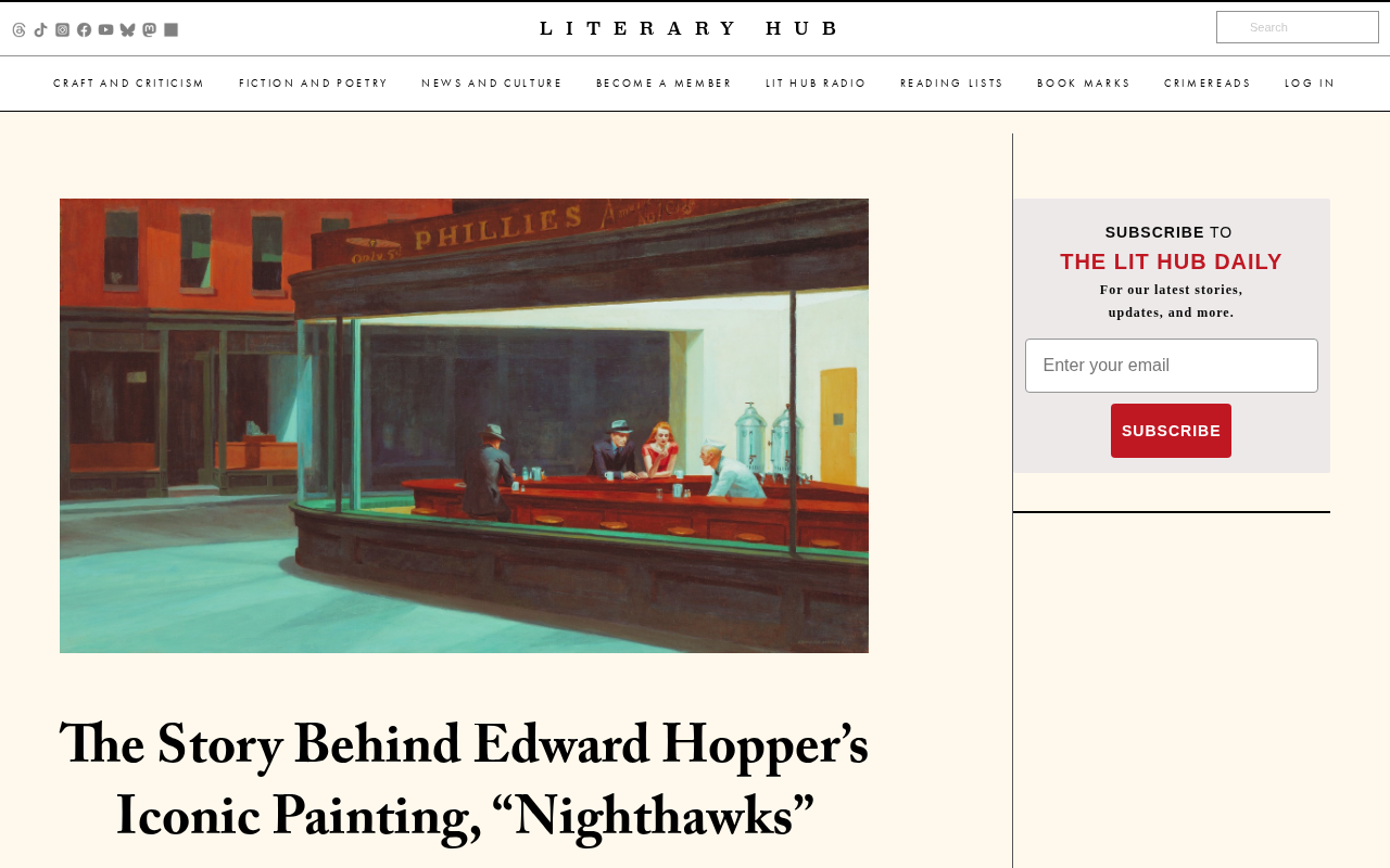
In a community like Hacker News, where the cultural axis is primarily technology, startups, and engineering, the fact that a mid-20th-century American painting is being discussed at all suggests a certain cross-disciplinary resonance. Edward Hopper's Nighthawks is exactly this kind of work—one that tech people cite again and again. It appears on office posters, book covers, and in discussions about "product atmosphere."
Why a painting becomes a talking point in tech communities
The title of this Hacker News post directly identifies the work: Edward Hopper's iconic painting Nighthawks. What makes this link worth noting isn't that it offers any new facts, but that it touches on a topic long discussed among technologists: how to convey complex emotional states with minimal visual elements. Nighthawks is often compared to the scene of coding late at night—a quiet interface, a handful of people online, an atmosphere that's hard to classify as either companionship or isolation. This analogy isn't far-fetched; rather, it reveals the common ground between design intuition and artistic intuition.
Edward Hopper (1882–1967) was one of the most important American realist painters of the 20th century, known for depicting alienation and loneliness in urban life. Nighthawks was painted in 1942, shortly after the attack on Pearl Harbor, and is regarded as a landmark work of American modern art, now held at the Art Institute of Chicago. Hopper excelled at creating psychological tension through clean geometric composition, stark light-and-shadow contrast, and empty space. His style is often categorized as "American Realism," though he himself emphasized an interest in light and form over social narrative. His work has had a profound influence on film (such as Hitchcock and the visual style of Blade Runner), photography, and literature—one reason Nighthawks has transcended the art world to become a pop-culture symbol.
What's actually in the painting
Nighthawks depicts a late-night all-night diner, with four figures visible through a large glass window: a man and a woman, a man with his back to the viewer, and a counter attendant looking down, busy at work. The interior is brightly lit while the street outside is completely empty, creating a stark inside-outside contrast. This compositional "container effect"—a small patch of warm brightness surrounded by vast cold darkness—is one of Hopper's signature techniques.
For those working on product interfaces, this painting offers a transferable structure: a localized area of extremely high information density, surrounded by large expanses of whitespace or darkness. A dark background paired with a small, brightly highlighted content area in dark mode is strikingly similar in visual logic to the composition of Nighthawks. This isn't to say interface designers are imitating Hopper, but rather that both visual languages share the same set of organizing principles around attention.
Light as a narrative tool
Hopper's handling of light is the most frequently analyzed aspect of this painting. The diner's fluorescent lighting doesn't make the scene warm—instead, it produces a cold, almost clinical illumination. The distance between the figures, the misaligned sightlines, and that glass space with no entrance together construct a kind of "loneliness in a crowd." This approach of telling emotional stories through light and spatial relationships remains a consistently effective reference for UX practitioners: emotion comes from structure, not decoration.
The title "Nighthawks" isn't Hopper's literal description of the scene but comes from the image of a sign reflected in the diner's glass window, and also hints that the figures are like nocturnal creatures drawn to light. The diner in the painting is widely believed to be based on an all-night restaurant in Greenwich Village, New York, but Hopper significantly simplified and reconstructed it: he removed all entrances, turning the space into an impenetrable glass container. This "de-entrancing" is key to the painting's sense of alienation—viewers are forced into the position of bystanders outside the window, able only to look, not to enter. Moreover, the figures barely interact; their gazes diverge, further reinforcing the state of physical proximity and psychological separation.
Hopper's handling of light is often called "Hopperesque light" in art history: it comes from a clear artificial or natural source yet presents an unnatural evenness and coldness, illuminating the scene while stripping it of warmth. This technique shares common ground with film noir lighting—both emerged around the 1940s and share a fascination with shadow, loneliness, and the urban night. For interface design, this concept corresponds to "light hierarchy": using brightness relationships to guide attention rather than relying on color or decorative elements. Highlighted cards in dark mode and spotlight-style modal popups are essentially reproducing this logic of light-based narrative.
From art history to engineering intuition
There's another, more practical reason Nighthawks keeps coming up in tech communities: it frequently appears in discussions about "late-night work culture." The all-night diner, the late-night street, a space with its lights still on—these images map directly onto the late-night scenes familiar to programmers, DevOps engineers, and indie developers. This correspondence gives a mid-century artwork a new interpretive context and gives tech people a visual outlet for talking about their own condition.
The discussion's activity on Hacker News (6 points, zero comments) suggests this is a quiet link rather than a heated debate. But the very act of submitting it to HN already demonstrates Nighthawks' cultural position among tech people: it's not a painting that needs explaining—it's a symbol that's understood by default.
Why it still works today
Nighthawks' enduring appeal lies in the fact that it offers no answers. The figures show no obvious emotional expression; viewers can't determine whether they're enjoying company or enduring isolation. This ambiguity is precisely why it's cited again and again—each generation can read its own circumstances into it. For those building digital products, this offers an important reminder about restraint: leaving room for interpretation is often more powerful than spelling everything out.
This painting also reminds us that the tech community's interest in art isn't pretension. When a system needs to convey emotion, create atmosphere, or simply maintain a touch of human warmth late at night, the choice of visual language becomes an engineering problem. Nighthawks keeps being brought up because it answers a version of this question with the fewest possible elements.
One-line Summary
Nighthawks has become a visual symbol repeatedly cited in tech communities thanks to its minimalist composition and emotional tension.
Paragraph Summary
Starting from a Hacker News discussion about Edward Hopper's Nighthawks, the article explores why this 1942 painting is repeatedly referenced in tech communities. The author points out that the painting's "container-style composition"—a small bright area surrounded by vast darkness—closely mirrors the visual logic of dark-mode interfaces and late-night work scenes. Hopper conveys "loneliness in a crowd" through light and spatial relationships rather than decoration, a technique that offers valuable reference for emotional design in UX. The article also emphasizes that the painting's ambiguity and restraint are core to its lasting appeal: it provides no clear answers, leaving space for viewers to interpret. The tech community's interest in art isn't pretension—it's about solving the engineering problem of how to convey emotion through visual language.
Related articles
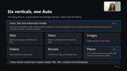
Microsoft WebIQ: Verifiable Real-Time Web Grounding for AI Agents
Microsoft WebIQ gives AI Agents real-time, citable web grounding across web, news, images, videos, and Places—164ms P95 latency, 50% fewer tokens, Scopes source control, and MCP integration.
Augmentable Gaussian Splatting: Building Photorealistic Simulation Environments for Robot Training
Team combines Gaussian Splatting with meshes to build photorealistic robot simulation environments, integrating MuJoCo Warp physics and Franka Panda for augmentable, relightable real-site simulation.

Gemini 4 Carbon Released: The Leap from Gemini 3 to Gemini 4 in Under a Year
Google releases Gemini 4 Carbon, less than a year after Gemini 3. In the official demo, Carbon reverse-engineered the Theme Park binary, added a new DeepMind-themed ride, and ported it to the web in one shot.