Jetpack Compose Adaptive UI: Ditch Device Branching, Embrace Window Capabilities

Compose adaptive UI should be driven by window capabilities, not device type; configuration changes are just another recomposition.
The article argues that branching UI by device category (phone, tablet, desktop) no longer works in the Compose era, because unfolding a foldable or split-screen makes the same device's window capabilities change at runtime. In Compose, configuration changes are just another recomposition; composables reading window state automatically respond, so developers don't need manual listeners. Core principles: drive UI decisions by current window size, posture, and hardware features—use WindowSizeClass to choose single/two-column layouts, and WindowLayoutInfo to get foldable posture and split content at the hinge. Practical tips: avoid hardcoding device type checks and test responsiveness by simulating window changes.
Why Device Branching No Longer Works
In Android development, adapting to different screen sizes has always been a thorny problem. In the traditional XML layout era, developers were used to branching UI based on device category (phone, tablet, desktop). But Jetpack Compose brings a completely new approach: configuration changes are just another recomposition, and UI decisions should be driven by the current window capabilities rather than device type.
In the past, developers would ask: "Am I running on a phone, tablet, or desktop?" and then choose a different layout based on device category. The fundamental problem with this approach is that even on the same physical device, the app context and UI capabilities can change dynamically at runtime.
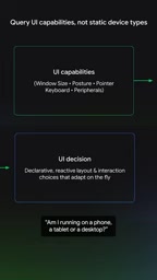
For example, when a user unfolds a foldable device, the window size changes instantly; or when entering split-screen mode, the app's available area shrinks. If the UI logic is tied to device category, these dynamic changes cannot be properly responded to. Device type is static, while user usage scenarios are dynamic.
Compose's Recomposition Mechanism: Configuration Changes Are Just Another Recomposition
In Compose, configuration changes (such as screen rotation, window size changes) are essentially just a recomposition. Recomposition happens all the time; when the window becomes wider—perhaps because the user unfolded the device—your composable will read the new state, and the UI depending on those states will automatically re-execute.

This mechanism means developers don't need to manually listen for configuration changes and rebuild the interface. Compose's declarative model lets the UI automatically respond to state changes. You just need to ensure the composable reads the correct state (such as window size), and the framework handles the rest.
Recomposition is the most core mechanism of the Jetpack Compose runtime: when the state (State) read by a composable changes, Compose re-executes the affected composable functions and updates the UI tree based on the new output. Unlike the traditional View system's "redraw/rebuild views," recomposition is on-demand and fine-grained—only composables that read the changed state are re-invoked, and unaffected subtrees are skipped (skippable).
Triggers for recomposition can be assignments to mutableStateOf, collection of StateFlow, changes to CompositionLocal, as well as updates to LocalConfiguration/window information caused by configuration changes. Understanding this is key: window size changes don't require special handling; they are just one of many state changes, and the framework automatically propagates the new window information to composables that read it.
Core Principles of Modern Adaptive Apps
The core principle of modern adaptive apps is: UI decisions should be driven by the currently active capabilities, including current window size, posture, and certain hardware features.

This means developers need to focus on "how wide is the current window" and "what posture is the device in," rather than "what device is this." For example, when the window width exceeds a certain threshold, a two-column layout can be shown; when the device is in a half-folded posture, content can be distributed across the two screen areas.
Window Size Classes
Compose provides window size classes (WindowSizeClass) to help developers classify based on the current window's width and height. These classifications are based on actual available space, not the device's physical size. Developers can use these classifications to adjust layouts, such as showing a single column at compact width and two columns at medium or expanded width.
WindowSizeClass is the window breakpoint specification provided by Material 3, dividing available window width into Compact (< 600dp), Medium (600–839dp), Expanded (840–1199dp), and the extra-large Large/ExtraLarge levels; height is also divided into Compact/Medium/Expanded. These breakpoints come from statistics on layout usability across many apps, not the physical size of a particular device, so the same device will fall into different size classes in split-screen or free-form window modes.
When using it, you typically obtain it via currentWindowAdaptiveInfo().windowSizeClass and read it in a composable; since it originates from window state, window changes automatically trigger recomposition. Note that size classes should only be used as the basis for layout structure decisions (such as single/two-column or navigation bar form); specific spacing, font sizes, and other details should still be fine-tuned using responsive constraints (such as maxWidth from BoxWithConstraints).
Posture and Hardware Features
Besides window size, device posture is also an important factor. Foldable devices can be in folded, unfolded, or half-folded states. In the half-folded posture, apps can use the hinge area to naturally separate content. Additionally, hardware features such as stylus support or the presence of a physical keyboard can also influence UI decisions.
Posture is a concept introduced by Android for foldable and large-screen devices, exposed through WindowLayoutInfo (from the androidx.window library). It is described by several DisplayFeatures, the most common being FoldingFeature, whose state can be FLAT (fully unfolded and flat) or HALF_OPENED (half-folded), orientation can be HORIZONTAL or VERTICAL, and which carries an isSeparating flag indicating whether the hinge truly splits the window into two logical areas.
Only the half-folded state with isSeparating == true is suitable for a two-pane layout; a flat-unfolded foldable is essentially still a continuous large screen and should be treated as a normal large window. Posture is typically obtained through the Flow returned by WindowInfoTracker.windowLayoutInfo(activity), subscribed to in a composable using collectAsState, so that fold state changes also trigger recomposition as state updates.
Building Adaptive UI with the Latest Compose Tools
Modern Compose tools and components make building adaptive UI simpler. Developers can use BoxWithConstraints or WindowSizeClass to obtain current window information, and then dynamically adjust the layout based on that information.

The key is to avoid hardcoding device type checks in code. Instead, pass window capabilities as state to composables, letting the UI automatically respond to changes. This way, the same code can run seamlessly on phones, tablets, foldables, and desktops, and can handle runtime window changes.
Practical Recommendations
- Use window size classes instead of device types: Obtain the current window's width and height classification via
WindowSizeClass, and decide the layout structure based on it. - Listen for window state changes: Use
rememberWindowSizeClassor similar APIs to obtain window information and ensure composables recompose when the window changes. - Consider posture and hardware features: For foldable devices, use
WindowLayoutInfoto obtain posture information and adjust the UI accordingly. - Test dynamic changes: During development, simulate window size changes (such as resizing the window or rotating the device) to ensure the UI responds correctly.
Summary
Jetpack Compose's adaptive UI philosophy is to shift UI decisions from device type to window capabilities. By leveraging the recomposition mechanism and modern Compose tools, developers can build truly responsive apps that adapt to various screen sizes and dynamic changes. Remember: configuration changes are just another recomposition—let the UI be driven by current capabilities, not device labels.
One-line Summary
Compose adaptive UI should be driven by window capabilities rather than device type; configuration changes are just another recomposition.
Paragraph Summary
The article points out that the traditional practice of branching UI by device category (phone, tablet, desktop) is no longer applicable in the Compose era, because scenarios like unfolding a foldable or split-screen cause the same device's window capabilities to change dynamically at runtime. In Compose, configuration changes are essentially just a recomposition; once a composable reads window state, it automatically responds to changes, and developers don't need to manually listen and rebuild the interface. The core principle of modern adaptive apps is to let UI decisions be driven by the current window size, posture, and hardware features: use WindowSizeClass to choose single-column or two-column layouts based on actual available space, and use WindowLayoutInfo to obtain foldable posture and separate content using the hinge. The article concludes with practical recommendations, emphasizing avoiding hardcoded device type checks and testing responsiveness by simulating window changes.
Related articles

Hermes Agent in Depth: From Deployment to Skills, MCP, and Hooks
A complete walkthrough of Hermes Agent based on a YouTube deep-dive: VPS deployment, soul.md and user.md memory layering, auto-generated skills, MCP and connectors for Notion, multiple profiles and sub-agent delegation, gateway and shell hooks, and voice call configuration essentials.

Codependency in Addiction: Let Go of the Rope So the Other Person Can Move Toward Recovery
Stanford addiction expert Dr. Anna Lembke explains how codependency sustains addiction: when families stop over-intervening, attend Al-Anon, and let go, addicted individuals are more likely to recover.

Where Does Autonomous Driving Training Data Come From? Cosmo 3 Uses Scene Graphs to Generate Multi-Sensor Data
Cosmo 3 offers a generative solution for autonomous driving training data: controlled generation via world scene graphs, synchronized RGB and LiDAR output, and continuous generation for closed-loop simulation, now open for developer trials.