Turning Handwriting into Fonts: A Look at the Ductus Project

The Ductus project turns real handwriting into usable fonts centered on stroke paths, drawing HN attention to the engineering details.
Ductus is a handwriting-to-font project that earned 201 points and 44 comments on Hacker News. Its core proposition is to build fonts around stroke paths rather than static glyph outlines, preserving the personality of handwriting. The article analyzes three engineering challenges: consistency (variation across multiple writings of the same character), data capture noise (line thickness, ink spread, etc.), and typographic fit (kerning, baseline alignment, etc.). HN discussion focused on usability and output quality rather than conceptual novelty, signaling the project has entered an engineering polish phase. The article also notes that the project's input pipeline design offers a reference for AI font generation tools, where the difficulty lies not in model architecture but in data quality, typographic constraints, and user expectation management.
Handwriting font tools are nothing new, but most existing solutions either rely on commercial software or require users to manually trace every character. The Ductus project (ductus.sorenblank.com), which recently sparked discussion on Hacker News, tries a different approach to answer one question: Can real handwriting be turned directly into a usable font without losing the personality of the strokes?
The project earned 201 points and 44 comments on HN, showing that this seemingly niche direction resonates with a fair number of developers and designers.
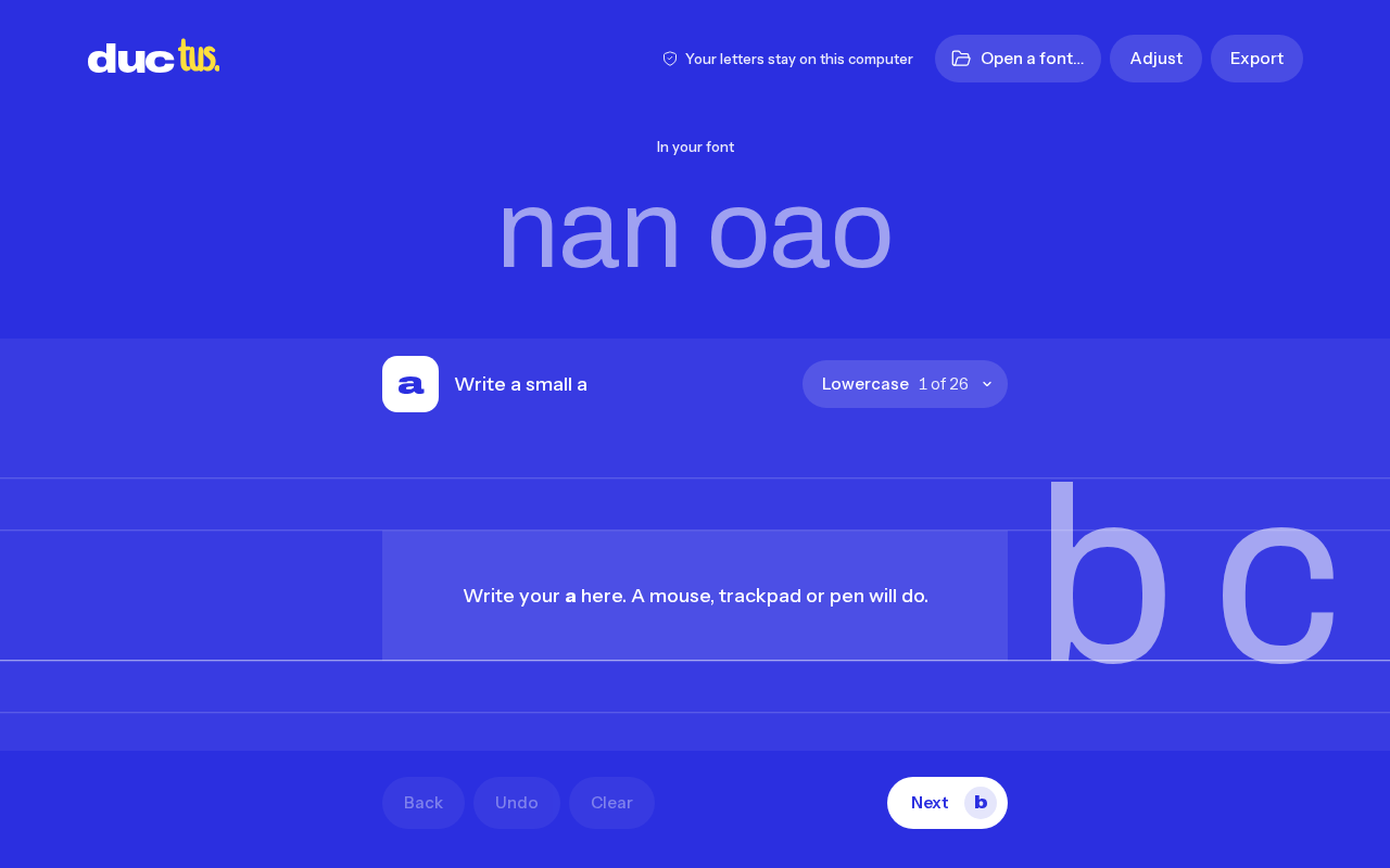
The Basic Approach of Ductus
The project's name hints at its design philosophy. In Latin, ductus means "handwriting" or "manner of writing," and it's also a term in type design describing stroke direction and the trajectory of the pen. Unlike the traditional font-making workflow—designing glyph outlines, adjusting Bézier curves, manually typesetting—Ductus's core proposition is to build fonts around the stroke path rather than around static glyph outlines.
This means the tool focuses not on "what this character looks like" but on "how the pen moved when writing this character." For handwriting, this distinction matters enormously: the recognizability of handwriting comes precisely from stroke speed, pressure variation, and connection style—information that is often flattened out in conventional outlining workflows.
Bézier curves are a parametric mathematical tool used in computer graphics to describe smooth curves, and they are particularly crucial in type design. Glyph outlines in TrueType and OpenType fonts are generally assembled from quadratic or cubic Bézier segments, and designers shape the curvature of stroke edges by adjusting control points. The core operation in traditional type design software (such as FontForge or Glyphs) is dragging control points on Bézier curves. Ductus's proposition of building fonts around stroke paths implies that it may first abstract handwriting into a centerline (skeleton) or a series of path points, then reverse-generate outlines based on attributes such as path width and speed—fundamentally different from tracing Bézier outlines directly from a bitmap.
Why Turning Handwriting into Fonts Is So Hard
Converting handwriting into fonts is difficult in several ways.
First, consistency. If a person writes the same character ten times, all ten will be different. Fonts require the same character to be consistent across different contexts, yet the charm of handwriting lies precisely in its inconsistency. How to balance these two demands is a tension every handwriting font project must face.
Second, data capture. Scanning a handwritten page is easy, but extracting usable vector outlines from it requires dealing with noise such as line thickness, ink spread, and paper texture. The quality of samples submitted by users varies widely, so the tool must be robust to some degree.
Third, typographic fit. A character looking good on its own doesn't mean it will connect naturally with the characters before and after it in a line of text. Kerning, baseline alignment, character width normalization—these details, which designers adjust one by one in manual font production, are hard for automated tools to get right in one pass.
Ductus is clearly not the first project to hit these walls, but the discussion it sparked on HN shows that the community believes this direction is worth pursuing. Judging from the comments, the discussion centers more on the tool's usability and output quality than on the novelty of the concept itself—which is usually a sign that a project has moved past the "idea validation" stage and entered the "engineering polish" stage.
Kerning refers to fine-tuning the horizontal spacing between specific character pairs. Combinations like "AV" or "To" look loose or cramped when arranged at default widths, so spacing corrections need to be defined individually. In handwriting fonts, since each character's width and slant may vary with writing habits, automatically calculating kerning is even more difficult: the tool must infer reasonable spacing rules from limited handwriting samples rather than relying on a designer to adjust each pair. Rendering engines (such as HarfBuzz) read the kerning table in a font file to apply these corrections, so whether a handwriting font generation tool can output correctly structured kerning data directly determines the usability of the generated font in actual typesetting.
Implications for AI Font Tools
Whether Ductus itself uses AI is not explicitly stated in the source material, but the approach the project represents overlaps heavily with the current direction of AI font generation.
In recent years, research on handwriting-based font generation has gradually increased, with core methods typically inferring a user's writing style from a few samples and then extending it to the full character set. The value of such methods lies in lowering the barrier: custom fonts traditionally require months of work and a considerable budget, whereas personalized font generation tools can let ordinary users obtain a usable font from a few lines of handwriting.
Ductus offers a reference point worth noting: it reminds us that the key to turning handwriting into fonts is not just the capability of the generation model, but also the design of the input pipeline—how handwriting is captured, how stroke information is preserved, and how typographic usability is maintained after generation. These engineering details often determine the final experience more than the model architecture does.
Style transfer in the font generation field typically works like this: given a small number of user handwriting samples, a model learns style features such as stroke thickness, slant angle, and ligature habits, then applies these features to the remaining characters in the standard character set. Common technical approaches include GAN-based (generative adversarial network) font style transfer, VAE-based (variational autoencoder) style encoding, and, more recently, few-shot font generation based on diffusion models. The common challenge of these methods is that style features and character content need to be effectively disentangled; otherwise, the generated glyphs may have distorted structure or reduced legibility. Although Ductus does not explicitly adopt these models, its idea of "preserving stroke information" is highly isomorphic at the engineering level to the goal of "preserving style vectors" in style transfer.
Who Should Pay Attention
For independent developers, Ductus is a small but complete product case study: starting from a specific handwriting pain point, offering a usable solution through technical means, and gaining early feedback in a community like HN.
For type designers, such tools are unlikely to replace manual font design in the short term, but they can serve as rapid prototyping tools—generating a rough draft from handwriting samples and then refining it by hand may be more efficient than drawing outlines from scratch.
For AI application developers, turning handwriting into fonts is a typical "style transfer" scenario, where the difficulty lies not in the model itself but in data quality, typographic constraints, and managing user expectations. Lessons from these three dimensions can be transferred to other personalized generation products.
As for the project's specific functional boundaries and output quality, it's best to visit ductus.sorenblank.com and try it yourself, or browse the user feedback in the 44 comments on the HN discussion thread—that usually contains more authentic evaluations than the project homepage.
Related articles
Codex in Practice: From Installation and Configuration to Multi-Agent Collaboration
Based on a Bilibili Codex course overview, this guide maps the full path of AI coding assistants from installation and agents.md context design to CLI commands, MCP integration, and multi-agent collaboration.
Claude Code Installation and Model Switching Guide for Users in China
How can developers in China install Claude Code reliably? This article compiles a Bilibili creator's hands-on solution: install via NPM, skip official login, use CC Switch to configure API Keys and freely switch between DeepSeek, Kimi, and other models to avoid account bans.
AI Supply Chain Security: What Canary Tokens Reveal
Starting from a Hacker News discussion, this article analyzes the role of canary tokens in AI supply chain security: how they detect abnormal access to model weights, training data, and credentials, as well as coverage blind spots and cost constraints during implementation.