CSS color-mix() in Practice: One Line of Code for Light/Dark Theme Color Switching
Use CSS color-mix() with theme-aware variables to handle light/dark hover effects in a single declaration.
CSS color-mix() offers an elegant solution for adapting hover effects across light and dark themes with a single line of code. By defining neutral color variables that flip between themes and blending them into component colors, you eliminate the need for duplicate media queries. Compared to relative colors, color-mix() provides better browser support, simpler code, and a more intuitive mental model for team collaboration.
In modern CSS, relative colors are an exciting feature, but in certain scenarios, the color-mix() function may be the more elegant choice. Renowned front-end educator Kevin Powell shared a typical use case in his latest video: when your project needs to support both light and dark themes, color-mix() lets you achieve twice the results with half the code.
The Limitations of Relative Colors in Theme Switching
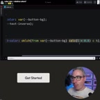
Suppose you have a button that needs to transition from white to dark gray on hover. Using CSS relative colors, you can modify the lightness value based on a CSS variable — for example, multiplying lightness by 0.8 to darken the button by 20% on hover.
CSS relative colors are a feature introduced in the CSS Color Level 5 specification that allows developers to derive new colors from an existing color by modifying its individual channel values. The syntax looks something like oklch(from var(--color) calc(l * 0.8) c h), and it works across multiple color spaces including RGB, HSL, LCH, and OKLCH. The core value of this feature is making color transformations declarative — instead of pre-calculating every derived color, you generate them dynamically at runtime from a base color. This is especially useful in design systems where you need to derive a large number of variants from just a few base colors.

This works great in dark themes — a dark button becomes even darker on hover, providing clear visual feedback. But the problem emerges when switching to a light theme: a light-colored button also gets darker on hover. While this makes logical sense (lightness × 0.8 does reduce lightness), the visual experience is far from ideal.
The core conflict is this: button hover in a dark theme should make the button darker, while button hover in a light theme should make it lighter. The linear transformation of relative colors can't automatically adapt to this directional difference, forcing you to write separate hover styles for each color scheme.
The Elegant Solution with color-mix()
The color-mix() function offers an entirely different approach. Instead of performing mathematical transformations on a color, it blends two colors in a given ratio. The key insight: you can make the blend target color itself change with the theme.
Basic Syntax Review
The basic usage of color-mix() is as follows:
color-mix(in srgb, var(--button-bg), var(--neutral-100) 20%)
The first parameter in srgb specifies the color space, followed by the two colors to mix. The percentage controls how much of the second color is blended in.
It's worth noting that the choice of color space significantly affects the blending result. srgb is the most traditional color space, and its blending results match most developers' intuitions, but it can produce muddy intermediate colors in certain transitions. If you're after more natural blending, try perceptually uniform color spaces like oklch or oklab — they ensure that numerically equidistant changes also appear equidistant to the human eye, typically producing more vibrant and natural intermediate colors. For subtle brightness adjustments like button hovers, srgb is perfectly adequate, but when blending across a wider hue range, the advantages of perceptually uniform color spaces become much more apparent.
Defining Theme-Aware Neutral Color Variables
The core of the technique lies in defining a --neutral-100 variable that takes different values under different themes:
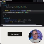
/* Light theme */
:root {
--neutral-100: hsl(0, 0%, 95%); /* Very light gray */
}
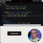
/* Dark theme */
@media (prefers-color-scheme: dark) {
:root {
--neutral-100: hsl(0, 0%, 5%); /* Very dark gray */
}
}
The prefers-color-scheme used here is a media feature defined in CSS Media Queries Level 5 that detects the user's color scheme preference set at the operating system level. When users toggle between dark and light modes in macOS, Windows, iOS, or Android system settings, the browser automatically responds to this change and applies the corresponding style rules. Beyond system-level preferences, many websites also provide manual toggle switches, typically by adding a data-theme attribute or specific class to the root element to override system preferences. In that case, you simply replace the media query with an attribute selector (e.g., [data-theme="dark"]), and the CSS variable theme-switching strategy works just the same.
In the light theme, --neutral-100 is a near-white light gray; in the dark theme, it flips to a near-black dark gray. This naming convention comes from the Design Tokens methodology — an approach to abstracting design decisions into platform-agnostic variables, originally popularized by Salesforce's Lightning Design System. The numeric suffix typically indicates a lightness scale, with 100 being the lightest and 900 the darkest. In theme-switching scenarios, the so-called "mirror flip" means that the light theme's 100 (light color) corresponds to the dark end in the dark theme. This strategy ensures semantic consistency — neutral-100 always represents "the neutral color closest to the background" rather than a fixed lightness value.
One Line of Code for Both Themes
When you use color-mix() in your hover styles to blend in this neutral color, the magic happens:
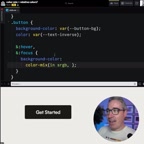
.button:hover {
  background-color: color-mix(in srgb, var(--button-bg), var(--neutral-100) 20%);
}
- In the light theme: The button background blends in 20% light gray → the button gets lighter
- In the dark theme: The button background blends in 20% dark gray → the button gets darker
The same single CSS declaration automatically adapts to two completely opposite visual directions. You don't need to write any additional media queries to handle hover effect differences.
Three Reasons color-mix() Is More Practical Than Relative Colors
Better Browser Compatibility
color-mix() has already reached Widely Available status, with support across all major browsers. "Widely Available" here refers to one of the Baseline status tiers for the Web Platform, maintained by the W3C WebDX Community Group. Baseline classifies web features into two levels: Newly Available (just supported across all major browser engines) and Widely Available (stably supported across all major browsers for over 30 months). color-mix() achieved full support in Chrome, Firefox, Safari, and Edge in early 2023, and currently has a global browser coverage rate exceeding 95%.
By comparison, CSS relative colors still have relatively limited support — Firefox didn't complete its implementation until late 2024, placing it at a much earlier compatibility stage. For production environments, color-mix() is the safer bet.
Half the Code
The traditional approach requires defining hover state color changes separately for light and dark themes, effectively doubling your code. With color-mix() paired with semantic CSS variables, a single declaration covers all scenarios. You might be writing twice as much CSS as you actually need.
A More Intuitive Mental Model
"Mix the button color with a neutral color at 20%" is easier to understand and maintain than "multiply the lightness by 0.8." The semantics of a mixing ratio are much clearer, and communication costs in team collaboration are lower. This difference is especially apparent when designers and developers work together — "blend in 20% of the background color" is a description that designers can intuitively grasp, whereas "multiply the lightness channel in OKLCH color space by 0.8" requires additional technical background to accurately understand the visual effect.
Practical Tips for Implementing color-mix() in Your Projects
For real-world projects, consider the following strategies:
- Build a semantic neutral color system: Define variables from
--neutral-100through--neutral-900, mirror-flipping them between light and dark themes. This variable system doesn't just servecolor-mix()— it can also form the foundation of your entire project's design token system, ensuring consistency and maintainability in color usage. - Control your mix ratios: 20% is a solid starting point — it produces noticeable visual feedback without being jarring. For more subtle interaction states (like focus), try 10%; for stronger state changes (like active/pressed), bump it up to 30%-40%.
- Don't completely abandon relative colors: In single-theme scenarios or when you need precise color transformations, relative colors remain a powerful tool. For example, when you need to precisely adjust a color's saturation while keeping hue and lightness unchanged, the channel-level operations of relative colors are something
color-mix()simply can't replace. - Use DevTools to verify results: Leverage your browser's developer tools color scheme emulation to verify effects under both themes in real time. In Chrome DevTools, you can quickly toggle via the "Emulate CSS media feature prefers-color-scheme" option in the Rendering panel, without modifying your system settings.
color-mix() and relative colors aren't mutually exclusive — each has its strengths. Understanding their respective use cases is the key to writing CSS that's both concise and robust.
Key Takeaways
Related articles
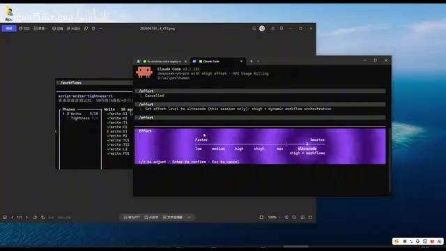
Claude Code Workflow in Action: 68 Sub-Agents Working Concurrently
Hands-on test of Claude Code's Workflow mode with 68 concurrent sub-agents. Covers setup, write-review separation, real concurrency results, and token costs.
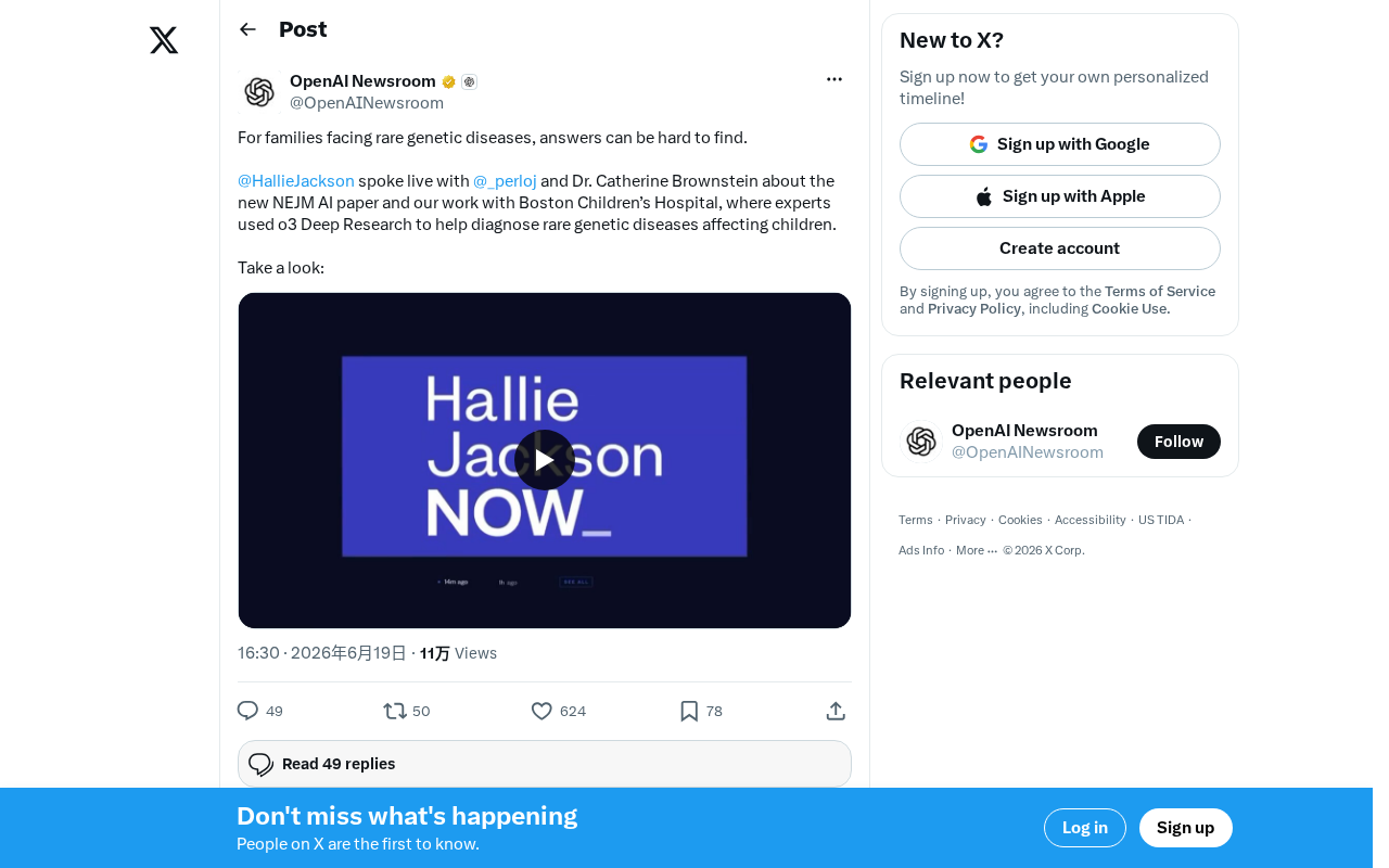
OpenAI o3 Helps Boston Children's Hospital Tackle Rare Genetic Disease Diagnosis Challenges
OpenAI's o3 Deep Research model partners with Boston Children's Hospital to assist rare genetic disease diagnosis. Published in NEJM AI, this human-AI collaboration shortens diagnostic timelines and advances precision medicine.
What Is Cursor? A Complete Guide to the AI-Native Programming IDE's Core Features and Use Cases
An in-depth look at Cursor, the AI-native programming IDE, covering intelligent code generation, multi-model support, context awareness, and how it compares to traditional IDEs across six key dimensions.