CSS if() Statements and Custom Functions: Media Queries Are About to Change Dramatically

CSS if() and @function are set to revolutionize how we write media queries.
CSS is introducing if() statements and @function custom functions that will fundamentally change responsive design. The if() function enables inline conditional logic at the property-value level, while @function allows developers to create reusable responsive utility functions. These features push CSS from declarative toward functional paradigms, reducing repetition and boosting expressiveness.
CSS media queries are one of the most fundamental tools for responsive design in front-end development, but the way we write them may soon undergo a radical transformation. Kevin Powell, a well-known front-end YouTuber, recently showcased the upcoming if() statements and custom functions (@function) coming to CSS — new features that will fundamentally change how we write media queries.
CSS Nesting: The First Step in Optimizing Media Queries
In traditional CSS, writing media queries requires repeating selectors, resulting in redundant and inelegant code. Now, CSS native nesting has gained widespread support, allowing us to nest media queries directly inside selectors and eliminating the need to repeat them.
CSS native nesting is part of the CSS Nesting Module specification and began receiving support in major browsers in 2023. Before this, nesting was an exclusive feature of CSS preprocessors like Sass and Less, and one of the core reasons developers chose to use them. Native nesting uses the & symbol to reference the parent selector, allowing child selectors and media queries to be written directly inside a selector block, thereby eliminating massive selector repetition in code. The arrival of this feature marks CSS gradually absorbing the best design ideas from preprocessors, reducing developers' dependency on build toolchains.
While this is just a small improvement, it makes code structure cleaner and reduces repetition. However, the truly exciting changes are still to come.
CSS if() Statements: Writing Conditional Logic Directly in Property Values
Future CSS will support using if() statements directly in property values. This means that if you only have one property that needs to change based on screen width, you can completely ditch the traditional @media block and write conditional logic right in the property value.
From a specification perspective, the CSS if() function originates from the Inline Conditionals proposal in the CSS Values and Units Module Level 5 specification. Unlike traditional @media rules, if() is a value-level conditional function that can appear anywhere a CSS value is accepted. This means the granularity of conditional logic shifts from "entire declaration blocks" down to "individual property values." In addition to media() conditions, if() also supports supports() (feature detection conditions) and style() (style query conditions), making it a general-purpose inline conditional mechanism — not limited to responsive design scenarios alone.
The syntax looks something like this:
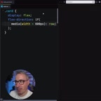
.container {
  flex-direction: if(media(width > 600px): row; else: column);
}
When the viewport width is greater than 600px, flex-direction is row (horizontal layout forming columns); otherwise it's column (vertical stacking).
This feature is already available in Chrome, though support in other browsers is not yet complete. Kevin also admits that this syntax might feel "a bit weird and hard to read" at first — after all, we're used to writing media queries as standalone code blocks, and suddenly stuffing conditional logic into property values definitely takes some getting used to.
CSS @function Custom Functions: The True Game Changer
If if() statements feel somewhat clunky, CSS custom functions (@function) offer a more elegant solution. You can define your own functions to encapsulate media query logic, making code both concise and highly readable.
CSS @function is a core part of the CSS Functions and Mixins Module specification. For a long time, functions in CSS (such as calc(), min(), max(), clamp()) were all browser built-ins — developers couldn't define their own. @function breaks this limitation, allowing developers to create reusable computational logic that accepts parameters and returns values. This complements CSS Custom Properties (CSS variables) — custom properties solve the problem of value reuse, while custom functions solve the problem of logic reuse. It's worth noting that the specification also includes a @mixin proposal, meaning CSS may natively support Sass-like mixin style block reuse in the future.
Here's the implementation approach Kevin demonstrated:
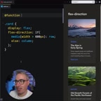
@function --mq-small(--narrow, --wide) {
  result: if(media(width > 600px): var(--wide); else: var(--narrow));
}
This function accepts two parameters: --narrow (the value for narrow screens) and --wide (the value for wide screens). Internally, it uses an if() statement to check the current viewport width and returns the corresponding value.
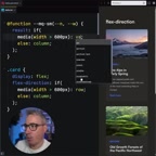
When used, the code becomes extremely concise:
.container {
  flex-direction: --mq-small(--narrow: column, --wide: row);
}
You can even define different functions for different breakpoints — like --mq-medium, --mq-large, etc. — forming a complete library of responsive utility functions. The advantages of this approach include:
- Semantic clarity: Function names directly express intent —
--mq-smallis self-explanatory - Reusability: Define once, use everywhere — breakpoint values only need to be maintained in one place
- Readability: Named parameters like
narrowandwideare far easier to understand than raw pixel values
What These New CSS Features Mean for Front-End Development
A Paradigm Shift from Declarative to Functional
Traditional media queries are "declarative" — you describe styles for different conditions in standalone code blocks. The new if() and @function push CSS in a more "functional" direction, where conditional logic can be embedded directly into property values.
In programming paradigms, declarative programming focuses on "describing what the result should be," while functional programming emphasizes "expressing computation through function composition." Traditional CSS is a quintessential declarative language — you declare what styles an element should have under certain conditions, and the browser handles the implementation. With the introduction of if() and @function, CSS gains core functional programming capabilities: conditional branching and function abstraction. This evolution forms an interesting parallel with the shift in JavaScript frameworks from imperative DOM manipulation to declarative components — every layer of the front-end tech stack is searching for the optimal balance between declarative and functional approaches.
This shift has both pros and cons. The upside is more compact code with related style logic concentrated in one place, eliminating the need to jump around the file to see styles at different breakpoints. The potential downside is that when a selector has many properties that need responsive changes, writing an if() for each one might actually be less clear than a traditional @media block.
Current Browser Support
It's important to note that these features are still in their early stages. The if() statement is already usable in Chrome, but Firefox and Safari haven't caught up yet. Support for @function may be even more limited. Therefore, it's still too early to use these features in production, but as a technical investment and learning direction, understanding them now is extremely valuable.
Browser support for new CSS features typically follows a gradual process: one browser engine (usually Chrome's Blink engine) implements experimental support first, followed by Firefox's Gecko engine and Safari's WebKit engine. Before all major browsers reach consensus on support, developers can use @supports rules for feature detection and implement progressive enhancement. For new features like if() and @function, a pragmatic strategy is: experiment actively in personal projects and prototypes, keep traditional media queries as fallbacks in production, and monitor compatibility data updates on platforms like Can I Use.
Relationship with Frameworks Like Tailwind CSS
If you're familiar with Tailwind CSS or other utility-first CSS frameworks, you'll notice that this "inline conditional" approach shares a similar philosophy with their responsive prefixes (like md:flex-row). The enhancement of native CSS capabilities is, to some extent, narrowing the gap between native CSS and utility frameworks.
The core philosophy of utility-first CSS frameworks like Tailwind CSS is to atomize styles into single-purpose class names and build interfaces through class composition. Their responsive design uses prefix conventions (like sm:, md:, lg:), which essentially encode media query breakpoint logic into class names. The emergence of native CSS if() and @function enables native CSS to handle responsive logic in a similarly inline fashion, but at different levels of abstraction: frameworks provide convenience at the HTML level, while native features enhance expressiveness at the CSS level. This doesn't mean frameworks will be replaced — they still provide value that native CSS hasn't yet covered, such as design system constraints, developer experience optimizations, and build-time optimizations.
Conclusion
CSS is undergoing a profound evolution. From native nesting to if() statements to custom functions with @function, these new features are making CSS more powerful and flexible. The way we write media queries may soon look very different from what we're used to today.
While these changes will take time to be widely adopted, they represent a clear direction for CSS development — less repetition, stronger expressiveness, and abstraction capabilities closer to those of programming languages. As front-end developers, now is the perfect time to start paying attention to and experimenting with these new features.
Related articles
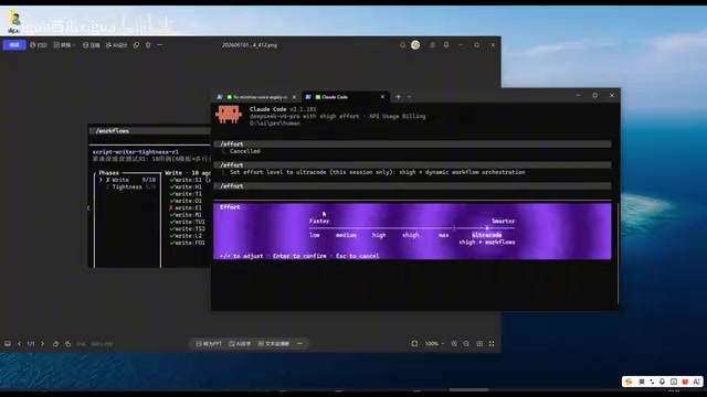
Claude Code Workflow in Action: 68 Sub-Agents Working Concurrently
Hands-on test of Claude Code's Workflow mode with 68 concurrent sub-agents. Covers setup, write-review separation, real concurrency results, and token costs.
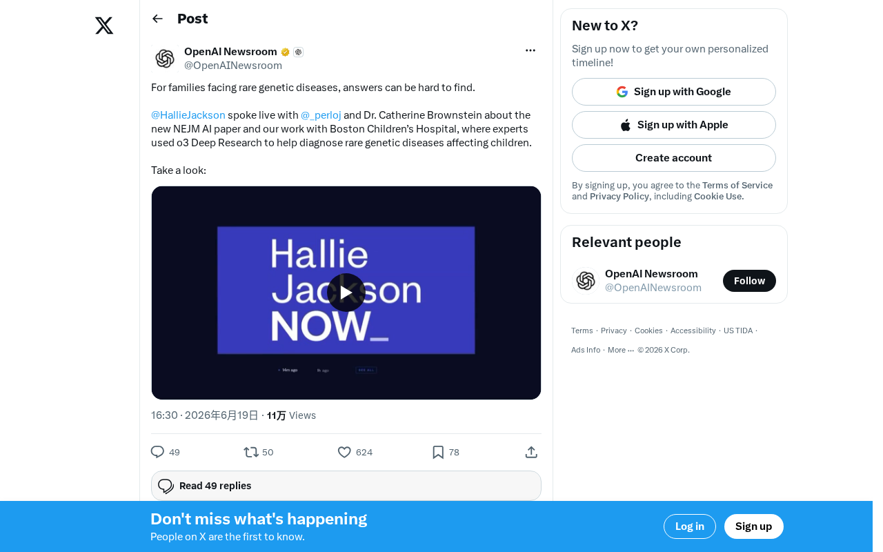
OpenAI o3 Helps Boston Children's Hospital Tackle Rare Genetic Disease Diagnosis Challenges
OpenAI's o3 Deep Research model partners with Boston Children's Hospital to assist rare genetic disease diagnosis. Published in NEJM AI, this human-AI collaboration shortens diagnostic timelines and advances precision medicine.
What Is Cursor? A Complete Guide to the AI-Native Programming IDE's Core Features and Use Cases
An in-depth look at Cursor, the AI-native programming IDE, covering intelligent code generation, multi-model support, context awareness, and how it compares to traditional IDEs across six key dimensions.