Three CSS Layout Patterns You'll Use in Every Project: Stack, Prose, and Pile
Three essential CSS layout primitives — Stack, Prose, and Pile — for every project.
Kevin Powell shares three CSS layout primitives he uses in every project: Stack (Flexbox-based vertical stacking with controllable gaps), Prose (typography-aware spacing using the lobotomized owl selector and em units), and Pile (Grid named areas for elegant element stacking). These patterns leverage custom property fallbacks and modern CSS features to create highly reusable, flexible layouts.
Kevin Powell is one of the most popular CSS-focused YouTube creators. In his latest video, he shared three CSS layout patterns (or "primitives") that he uses in every project: Stack, Prose, and Pile. These three patterns may seem simple, but through clever use of custom properties and layout techniques, they can dramatically improve the maintainability and flexibility of your CSS code.
Stack: Controlled Vertical Stacking with Flexbox
The Basic Principle
The Stack pattern is the most fundamental vertical layout approach. The core idea: first reset all default spacing with margin: 0, then reintroduce controlled spacing using Flexbox.
.stack {
  display: flex;
  flex-direction: column;
  gap: var(--stack-gap, 1rem);
}
Interestingly, Kevin admits he used to be a die-hard Grid advocate, but has since switched to Flexbox for the Stack pattern. The reason is that Grid produces what he calls "mystery spacing" — when a parent container is stretched, Grid's auto row height generates invisible extra space that you can't track down even with DevTools.
Flexbox and Grid are the two modern layout systems in CSS, but they were designed with different purposes in mind. Flexbox is a one-dimensional layout model, excelling at distributing space and aligning elements along a single axis (row or column). Grid is a two-dimensional layout model, excelling at controlling both rows and columns simultaneously. In practice, the boundary between them isn't always clear — many scenarios can be handled by either, but subtle behavioral differences (like Grid's implicit row height calculations or Flexbox's flex-shrink mechanics) can produce dramatically different results in specific situations. Kevin's shift from Grid to Flexbox for the Stack pattern is a textbook example of these subtle differences being amplified in real-world projects.

Why Flexbox Beats Grid for Stack Layouts
While you can fix Grid's spacing issues with align-content: start and justify-items: start, doing so "shortens" the Grid container, making it impossible to use margin-block-start: auto to push elements to the bottom. Flexbox supports this pattern natively:
.card .btn {
  margin-block-start: auto; /* Easily push the button to the bottom of the card */
}
This is extremely common in card layouts — you want the button to always stick to the bottom of the card regardless of content length. Flexbox makes this effortless. Here's how margin-block-start: auto works: in a Flex container, auto margins absorb all remaining space in that direction, pushing the element to the opposite side. This is the same mechanism as the classic margin: 0 auto for horizontal centering, just applied on the block axis (vertical direction).
The Undeclared Custom Property Fallback Trick
Kevin shared an elegant technique: the --stack-gap custom property is never declared anywhere — not in :root, not on any component. He simply uses the fallback value syntax within gap:
gap: var(--stack-gap, 1rem); /* defaults to 1rem */
This means any component using Stack can override the spacing as needed:
.card {
  --stack-gap: 0.5rem; /* Tighter spacing inside cards */
}
CSS custom properties (also known as CSS variables) are property names prefixed with --, referenced via the var() function. Unlike preprocessor variables (like Sass's $variable), CSS custom properties are resolved at runtime and follow CSS's cascade and inheritance rules. This means child elements inherit custom properties defined on parent elements, and can redefine them at any level to override. The second argument of var() is a fallback value that only takes effect when the custom property is undefined. Kevin leverages exactly this feature: by intentionally not declaring the variable, the fallback acts as the default value, and customization only requires declaring the variable at the appropriate scope. This pattern avoids global variable pollution and eliminates the need to increase selector specificity or use !important.
Prose: A Typography Spacing Pattern Designed for Long-Form Content
The Fundamental Difference Between Prose and Stack
Stack provides uniform spacing, which makes sense for UI components like cards. But for articles, blog posts, and other long-form content, uniform spacing is actually a problem — headings should be closer to the paragraphs that follow them, while different sections should have more visual separation.
The Prose pattern uses the classic "lobotomized owl" selector combined with em units:
.prose * + * {
  margin-block-start: var(--prose-spacing, 1em);
}
The "lobotomized owl" selector * + * was introduced by Heydon Pickering in 2014, named for its resemblance to a blank-faced owl. It leverages the adjacent sibling combinator + to select every element that immediately follows another element — in other words, every child element except the first one. The brilliance of this selector is that it provides a universal, tag-agnostic solution for spacing between elements. In the .prose * + * form, it's scoped to the .prose container, ensuring that only elements within long-form content areas receive typographic spacing without affecting other UI components.
Why em Units Instead of rem
The key here is 1em rather than 1rem. Since em is based on the current element's font size, the spacing after an h2 will be larger than the spacing after a p. This perfectly aligns with typographic hierarchy principles:
- Related content stays close: Paragraphs sit tight beneath their associated headings
- Different sections separate: Larger headings naturally create more visual separation
- Automatic adaptation: No need to set spacing individually for each element type
In CSS, em and rem are both relative units but with different reference points. rem (root em) is always relative to the root <html> element's font size, typically 16px, so 1rem represents the same absolute size anywhere on the page. em is relative to the current element's font-size, meaning that 1em on an h2 (typically 1.5rem, about 24px) equals roughly 24px, while 1em on a p (typically 1rem, about 16px) equals roughly 16px. This "context-sensitive" behavior is extremely useful in typography — it automatically ties spacing to the text hierarchy, giving larger headings more spacing and body text tighter spacing, perfectly following the classic typographic principle that "spacing should be proportional to font size."
If you've used Tailwind CSS's @tailwindcss/typography plugin, its prose class applies exactly the same principle. Kevin notes that some people find the owl selector "unreadable," yet they happily use Tailwind — which does the exact same thing under the hood.
Kevin also mentioned that he used to call this pattern flow (reintroducing content flow), but later renamed it to prose because the name is easier to understand.
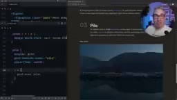
Pile: A Stacking Layout Pattern Based on Grid Named Areas
Basic Implementation
Pile is the most creative of the three patterns, using Grid's named areas to stack multiple elements in the same position:
.pile {
  display: grid;
  grid-template-areas: "pile";
  place-items: center;
}

.pile > * {
  grid-area: pile;
}
All child elements share the same Grid area, so they naturally stack on top of each other. This is far more elegant than position: absolute because the elements remain in the document flow, and the container automatically sizes itself to the largest child element.
CSS Grid's grid-template-areas property lets developers name grid regions using strings, then place child elements into specified areas via grid-area. Normally each area name is unique, used to create semantic page layouts (like header, sidebar, main, footer). But Kevin's Pile pattern cleverly exploits a feature: when multiple child elements are assigned to the same named area, they stack within that area — similar to absolute positioning, but with a crucial difference: these elements still participate in normal document flow calculations. The container's size is determined by the largest child element rather than collapsing as it would with absolute positioning — this is especially important in responsive design since you don't need to manually set a fixed height on the container.
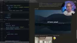
Classic Use Case: Hero Section with Text Over Image
The most common use case is a hero section with text overlaid on an image. Place both the image and the content container inside a .pile, and they'll automatically center and stack. Combined with z-index (which works natively in a Grid context), you can control the stacking order.
Note: You should use place-items here, not place-content. In CSS Grid, place-items and place-content are two easily confused properties with very different behaviors. place-content is shorthand for align-content and justify-content, controlling how entire grid tracks are distributed within the container — when the total grid size is smaller than the container, it determines how the extra space is allocated. place-items is shorthand for align-items and justify-items, controlling how each grid item aligns within its assigned cell. In the Pile pattern, since all elements share the same area, place-items: center ensures each element is centered within that area. If you mistakenly use place-content: center, you'd be centering the entire grid track instead, potentially causing content to shift to the container's edge rather than stacking centered.
Advanced Usage: Featured Cards and Avatar Badge Positioning
Pile's real power shines when combined with align-self and justify-self for precise positioning:
Featured cards — text overlaid on an image with a gradient:
.featured-card .content {
  align-self: end; /* Push text to the bottom */
  /* Combined with a gradient background for readability */
}
Avatar badges — notification dot positioning:
.badge {
  place-self: start end; /* Position at the top-right corner */
}
place-self is shorthand for align-self and justify-self, where start end means top vertically and right horizontally. This approach is more robust than traditional absolute positioning — no need to hardcode pixel values, and it automatically adapts when the container size changes. Elements stay anchored to their relative position within the grid area rather than depending on fixed top and right offsets.
Core Design Philosophy: Primitives Set the Stage, Components Fine-Tune
The central idea running through all three patterns is: let layout primitives handle the general layout logic, and make targeted adjustments at the component level. Stack sets vertical spacing, but the button's margin-block-start: auto is added on the card component. Pile sets stacking behavior, but the badge's place-self is specified on the individual element.
The "layout primitives" mindset Kevin advocates isn't an isolated practice — it's deeply aligned with modern CSS architecture methodologies. The Composition layer in Andy Bell's CUBE CSS methodology (Composition, Utility, Block, Exception) is specifically designed for defining these kinds of layout primitives. The Every Layout project (co-authored by Heydon Pickering and Andy Bell) systematically introduced a series of layout primitives including Stack, Cluster, Sidebar, Switcher, and more. The core of this thinking is to extract layout concerns from specific components, forming composable, content-agnostic layout units. Combined with a Design Tokens system, values like spacing and breakpoints within layout primitives can be managed centrally, ensuring consistency across the entire design system.
This layered approach keeps CSS code highly reusable without sacrificing flexibility. Combined with the undeclared custom property fallback pattern, you can easily override default behavior at any level without increasing selector specificity or resorting to !important.
These three CSS layout patterns aren't complex, but they represent a mature CSS architecture mindset — solving the most common layout problems with the least amount of code.
Related articles
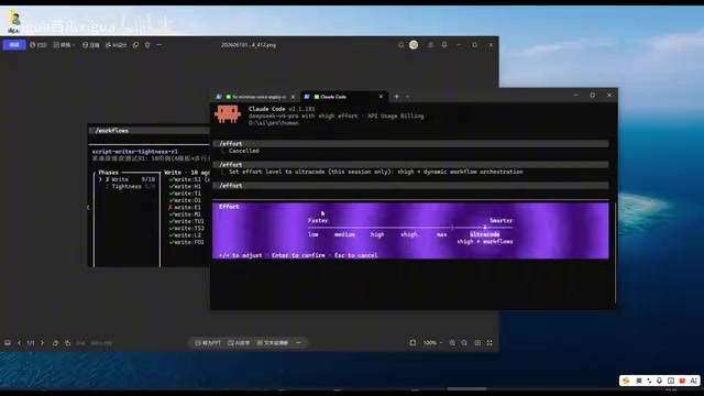
Claude Code Workflow in Action: 68 Sub-Agents Working Concurrently
Hands-on test of Claude Code's Workflow mode with 68 concurrent sub-agents. Covers setup, write-review separation, real concurrency results, and token costs.
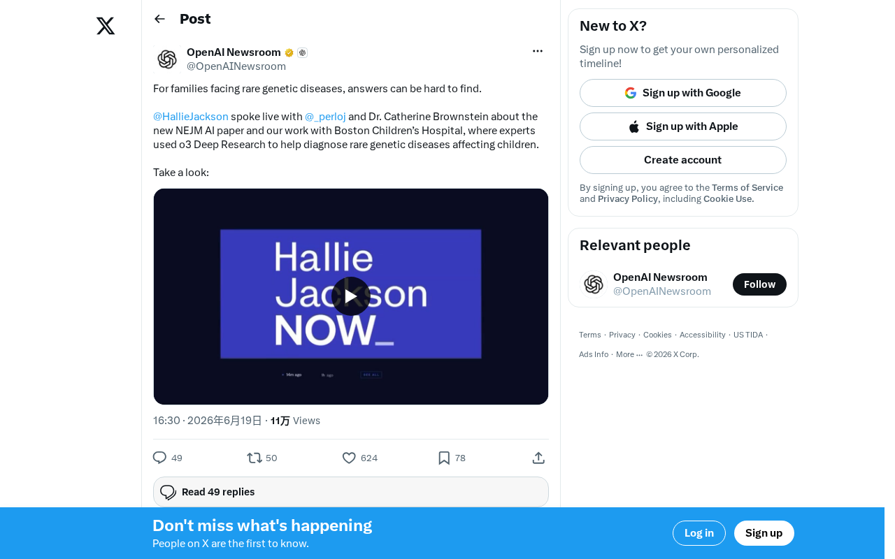
OpenAI o3 Helps Boston Children's Hospital Tackle Rare Genetic Disease Diagnosis Challenges
OpenAI's o3 Deep Research model partners with Boston Children's Hospital to assist rare genetic disease diagnosis. Published in NEJM AI, this human-AI collaboration shortens diagnostic timelines and advances precision medicine.
What Is Cursor? A Complete Guide to the AI-Native Programming IDE's Core Features and Use Cases
An in-depth look at Cursor, the AI-native programming IDE, covering intelligent code generation, multi-model support, context awareness, and how it compares to traditional IDEs across six key dimensions.