Why the NBA App Icon Went Viral: Decoding the 'Aura' Behind Great App Icon Design

Why the NBA app icon went viral and what it reveals about great app icon design.
A tweet praising the NBA app icon's 'unmatched aura' went viral, sparking a broader conversation about app icon design. This article analyzes the design psychology behind impactful icons — from dynamic update strategies and high-contrast color palettes to emotional resonance — and offers practical takeaways for product teams looking to turn their app icon into a competitive advantage.
A Single Icon Sparks a Viral Conversation
Recently, a Twitter user posted that "The aura of the NBA app icon right now is unmatched," quickly igniting a passionate discussion on social media about app icon design.
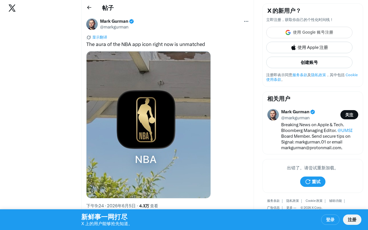
This seemingly simple comment actually touches on a topic that's often overlooked yet critically important in mobile app design — how an app icon, as the very first touchpoint between users and a product, can convey brand value and emotional resonance through visual design.
Why App Icon Design Matters So Much
First Impressions Drive User Behavior
In the mobile era, the average user has 80 to 100 apps installed on their phone. In this crowded visual landscape, app icons serve multiple functions:
- Brand recognition: Helping users instantly spot your product among dozens of icons
- Emotional communication: Conveying brand personality and attitude through color and composition
- Timeliness: Updating designs to align with special events, seasons, or holidays to keep things fresh
The NBA app frequently updates its icon during key moments like the playoffs and the Finals, incorporating the most buzzworthy elements of the current season. This dynamic update strategy ensures that every time users see the icon, they feel the excitement of the game — and that's exactly what sparked this whole "aura" conversation.
Dynamic Icon Strategies Are Going Mainstream
More and more leading apps are adopting a "dynamic icon" strategy — swapping out their app icons based on specific events or moments in time. Three core factors are driving this trend:
- Boosting user engagement: A new icon acts as a silent push notification, grabbing attention without requiring a pop-up
- Creating social buzz: As this viral tweet demonstrates, a standout icon design can spark organic user sharing
- Reinforcing brand moments: Tightly linking major events with brand visuals deepens user memory and association
Deconstructing Icon "Aura" Through Design Psychology
What Gives an App Icon Its "Aura"
When a user describes an icon with the word "aura," the assessment may sound subjective, but it's remarkably precise. From a design psychology perspective, an icon with a powerful presence typically has these characteristics:
- High-contrast color palette: Stands out against any wallpaper background with strong visual impact
- Clean, powerful composition: Balanced information density — no cluttered elements, with a clear focal point
- Emotional resonance: Connects with trending events that users are currently paying attention to, triggering a sense of relevance
- Perceived quality: Polished details — subtle treatments like rounded corners, shadows, and gradients that signal professionalism
Practical Takeaways for Product Teams
This case offers several thought-provoking insights for product designers:
- Reduce cognitive load: A great icon lets users find and tap it without thinking
- Build emotional connections: The emotional dimension of visual design remains irreplaceable — even the most powerful technology needs a compelling "front door"
- Create competitive differentiation: In a market where features are increasingly similar, icon design is a low-cost, high-return way to stand out
Every Pixel Is an Opportunity to Connect with Users
A small app icon reflects a product team's relentless pursuit of user experience excellence. In an age of scarce attention, an icon isn't just an entry point — it's a silent conversation between a brand and its users.
The NBA app team clearly understands this. By continuously refining their icon design and dynamically updating it in sync with the rhythm of the season, they maintain a constant presence and relevance on users' home screens. For all product designers, this is a strategy worth learning from: treat your icon as an integral part of the product experience, not just a static logo.
Related articles

CodeGraph: The 50K-Star Open-Source Tool That Cuts AI Coding Token Usage in Half
CodeGraph is a 50K-star open-source tool that builds a code knowledge graph so AI coding assistants can locate code instantly—cutting Token usage by 47%, boosting speed by 22%, all running 100% locally.

VibeCoding Beginner's Guide: A Complete Guide to Building Software with Natural Language from Scratch
VibeCoding lets anyone build software through natural language conversations with AI. Learn the core concepts, learning path, and practical methods to get started.

Using UU Accelerator to Speed Up Cursor: A Compliant Solution for Stable AI Coding in China
Learn how to use NetEase UU Accelerator to speed up Cursor AI coding tool in China, with step-by-step setup including node selection and launch configuration.