GitHub's New PR Overview Page: Spot Merge Blockers at a Glance
GitHub's new PR overview page consolidates merge status and key info at the top, reducing the cost of hunting for information.
GitHub has launched a new PR overview page that consolidates merge status, CI check results, approval feedback, unresolved comments, and pending actions into a compact summary at the top, replacing the old layout where information was scattered across the bottom, sidebar, and diff. Accompanying updates include an unresolved comment filter, newest-first sorting, and an activity panel aggregating all events. The article argues the "conclusion-first" layout significantly reduces judgment costs for reviewers and maintainers, especially for teams with high PR volume, while noting that information aggregation can't replace the human effort of review itself and that the redesign brings adaptation costs, with whether the old view will be retained still unclear.
GitHub's Pull Request page is undergoing a significant information architecture overhaul. According to a new feature introduction published on Product Hunt, GitHub has rolled out a brand-new PR overview page that consolidates merge status, check results, approval feedback, comments, and pending actions into a compact summary at the top. For developers handling large volumes of PRs daily, this means no more scrolling back and forth through a long page to figure out "where exactly is this stuck."
From "Hunting for Information" to "Information Coming to You"
The problem with the traditional PR page is that information is scattered. CI checks are at the bottom, approval status is in the sidebar, unresolved comments are strewn across the diff, and the merge button only lights up once a pile of conditions are met. To determine whether a PR can be merged, developers often have to jump back and forth between multiple areas.
The new overview page brings merge status to the very top. This change looks simple, but it actually alters the default reading order of the PR page: give you the conclusion first, then let you drill into details as needed. Whether checks pass, how many approvals are required, whether there are blocking comments—these key signals that determine whether a PR can move forward are all compressed into a compact summary area. For reviewers and maintainers, this "conclusion-first" layout can significantly reduce the cost of judgment.
CI checks (Continuous Integration) refer to the automated build, test, and static analysis pipelines that run after code is submitted, typically driven by tools like GitHub Actions, CircleCI, or Travis CI. On the PR page, CI check results are presented as status indicators (such as a green checkmark, yellow in-progress, or red X), serving as the first hard gate for determining whether code meets the merge threshold. Many repositories configure branch protection rules requiring "all checks must pass before merging," so CI status directly determines whether a PR can enter the human review stage. When checks fail, developers need to open the specific logs to pinpoint the cause—and this is one of the most prominent pain points of information scattering on the traditional PR page: status at the bottom, logs on another page, and fixes happening locally.
Three Detail Improvements Worth Noting
Beyond the top summary, this update also brings several highly practical features.
Unresolved comment filter. Review discussions on large PRs often start at dozens of comments, and figuring out which ones are resolved and which are still blocking the merge used to require manual digging. The filter lets you isolate unresolved comments, putting pending items directly on the table.
Newest-first sorting. Comments and activity are now sorted in reverse chronological order by default, so the latest developments are clear at a glance—no more scrolling to the very bottom to find the newest updates.
Activity panel. Events of all kinds on a PR—commits, comments, approvals, status changes—are aggregated into a single panel, forming a traceable timeline. For maintainers who need to understand how a PR evolved, this is more coherent than information scattered across various tabs.
Branch protection rules are a set of pre-merge conditions configured by GitHub repository administrators. Common items include: requiring a specified number of approvals, requiring specific CI checks to all succeed, requiring the branch to be up to date with the target branch, and prohibiting force pushes. The reason the merge button on the PR page "only lights up once a pile of conditions are met" is precisely because these rules are in effect. By consolidating merge status and blocking reasons at the top, the new overview page essentially visualizes the progress toward satisfying these rules, so developers don't have to check the sidebar or settings page item by item. For enterprise teams, branch protection is often tied to compliance audits, so the accuracy of the summary area directly affects the smoothness of the merge workflow.
Why This Change Resonates
This product received 92 upvotes on Product Hunt, ranking 8th for the day in the Developer Tools category. That's not an explosive vote count, but considering the target audience is heavy GitHub users, the signal suggests the pain point is real.
PR review is one of the most frequent operations in open-source collaboration and team development, and also where friction concentrates most. Any change that reduces time spent "hunting for information" will be keenly felt by high-frequency users. GitHub's product iteration direction in recent years confirms this: from Projects to Issues and now to the PR overview, the core logic is always about converging scattered status information into fewer interface layers.
It's worth noting the difference in value this kind of improvement delivers for large open-source projects versus enterprise teams. Small teams with few PRs can tolerate scrolling a few times; but when a repository receives dozens of PRs daily, the summary capability of the overview page directly affects maintainers' throughput.
Product Hunt is a community platform for launching new products and tools, where users can upvote and comment on products launched that day, and the platform generates daily and weekly rankings based on votes. The "92 votes, 8th for the day" mentioned in the article comes from the platform's daily ranking data. It should be noted that Product Hunt's audience consists mainly of early adopters and product enthusiasts, so vote counts reflect "attention" rather than "usage." For a product like GitHub that already has a massive existing user base, ranking position can only serve as one side reference for demand signals and should not be directly equated with actual adoption rates or satisfaction.
A Sober Observation
The new overview page solves the information aggregation problem, but the fundamental bottleneck of PR review often isn't information visibility—it's the human effort that review itself requires. The summary page helps you quickly determine "where this PR is stuck," but it can't do the code review for you. For maintainers, it's more of a triage tool: quickly identifying which PRs can be merged immediately, which need the author to add more, and which need in-depth review.
Additionally, interface redesigns always come with an adaptation cost. Users accustomed to the old layout may need time to rebuild muscle memory. Whether GitHub will offer a toggle to keep the old view isn't clear from the product introduction, and this will be a variable affecting the migration experience.
Overall, this is a pragmatic product improvement—no flashy concepts, just targeting the real small frictions in developers' daily work. For teams with high PR volume, it's worth trying out as soon as the redesign goes live.
One-line Summary
GitHub's new PR overview page consolidates merge status and key information at the top, reducing the cost of hunting for information.
Paragraph Summary
GitHub has launched a brand-new PR overview page that consolidates merge status, CI check results, approval feedback, unresolved comments, and pending actions into a compact summary at the top, changing the previous situation where information was scattered across the bottom, sidebar, and diff. Accompanying updates include an unresolved comment filter, newest-first sorting, and an activity panel that aggregates events of all kinds. The article argues that the "conclusion-first" layout can significantly reduce the judgment cost for reviewers and maintainers, with higher value for teams with high PR volume; at the same time, it soberly notes that information aggregation cannot replace the human effort of review itself, and that interface redesigns come with adaptation costs, with whether the old view will be retained still unclear.
Related articles
Codex and AI Coding Agents in Practice: A Complete Guide from Prompts to MCP
A Codex-centered guide to agentic coding: Task-Context-Output prompts, AGENTS.md project memory, plan mode, skills, characterization vs. spec tests, permissions and config.toml, MCP tool calls, plus secrets safety and context management.

GPT-6 Security Model and the AI Attack-Defense Escalation: This Week in AI
This week in AI: OpenAI's GPT-6 Saber found 948 Linux kernel root-escalation paths; Cursor deploys full apps from one sentence; Binance details a social engineering attack; C++26 fails ISO vote.
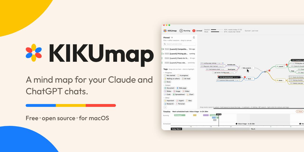
KIKUmap: Manage Your Claude and ChatGPT Conversations with Mind Maps
KIKUmap is a macOS menu bar app that visualizes Claude and ChatGPT conversations as mind maps with real-time status. Free and open source.