Dark Mode for WeChat Mini Programs: One-Click Color Scheme Generation with Pencil MCP

Build WeChat Mini Program dark mode using Pencil MCP for color schemes and Theme.js for switching.
This article walks through implementing dark mode in a WeChat Mini Program end-to-end. It covers using Pencil MCP with AI models to generate dark color schemes, processing AI-generated background assets, building a Theme.js utility class for theme state management, organizing resources by theme, leveraging CSS custom properties for dynamic styling, and integrating system dark mode detection via WeChat APIs.
Introduction
Dark Mode has become a standard feature in modern applications. Whether it's reducing eye strain or enhancing user experience, theme switching is an essential part of mini program development. However, the entire process from design to implementation involves quite a few steps — color scheme design, asset management, CSS variable system setup, system theme detection, and more — each requiring careful handling.
Based on Lesson 10 of a Bilibili creator's AI programming course series, this article provides a detailed breakdown of how to use the Pencil MCP tool to generate a dark color scheme with one click and implement a complete theme switching feature in a WeChat Mini Program.
Technical Principles of Theme Switching in Mini Programs
CSS Variable-Driven Style Switching
WeChat Mini Program interfaces are essentially controlled by WXSS (CSS-like) styles, including colors, fonts, spacing, backgrounds, and other visual elements. The core idea behind theme switching is to manage color schemes uniformly through CSS variables — when switching themes, you only need to change the variable values, and all components referencing those variables will automatically respond.
The CSS variables mentioned here are formally called CSS Custom Properties, defined with the -- prefix and referenced using the var() function. They differ fundamentally from variables in preprocessors like Sass or Less: preprocessor variables are replaced with fixed values during compilation, and the variable concept no longer exists in the compiled CSS. CSS Custom Properties, on the other hand, are natively supported by the browser at runtime and can be dynamically modified — when changed, all styles referencing those variables are immediately recalculated and applied. This is the technical foundation that enables real-time theme switching without page reloads. WeChat Mini Program's WXSS has supported CSS Custom Properties since base library version 2.11.0, covering the vast majority of active devices.
The traditional approach is to hardcode fixed color values in each component, requiring two complete sets of style files for dark mode — extremely costly to maintain. The CSS variable approach is far more elegant: define variables like --color-primary and --color-background globally, have components reference them uniformly, and simply swap the variable values when switching themes.
Lightweight Color Switching vs. Heavyweight Theme Packages
In practice, theme solutions typically fall into two categories:
- Heavyweight theme packages: Common in large desktop applications, where switching themes may change not only colors but also layouts and interactions. This requires installing complete theme packages containing styles, layouts, and compatibility code, sometimes even requiring a software restart.
- Lightweight color switching: Within a fixed layout framework, only details like font colors, background colors, and line spacing change, while interaction logic remains the same. This is exactly the approach used for mini program dark mode.
From a technical evolution perspective, frontend theme switching has gone through several phases: the earliest approach involved preparing multiple CSS files and switching them via <link> tags, with the downside of noticeable Flash of Unstyled Content (FOUC) during switching. Later, the React ecosystem popularized CSS-in-JS solutions (like styled-components' ThemeProvider), dynamically generating styles through JavaScript at runtime — flexible but with performance overhead. Today, CSS Custom Properties have become the mainstream approach, combining runtime dynamism with native CSS rendering performance without depending on any framework. The mini program's choice of lightweight color switching + CSS variables is the optimal solution under mobile performance constraints — it avoids the bundle size bloat from loading multiple style files while achieving millisecond-level theme switching response.
This hands-on project uses the second approach — adapting both light and dark modes while keeping layout and interactions unchanged.
Generating a Dark Color Scheme with Pencil MCP
Starting from the Design System
The project originally used Pixso for design but later migrated to Pencil, because Pencil delivers more refined design results and has built-in AI image generation capabilities. The current light theme uses a cream-white minimalist hand-drawn style, with all card backgrounds, page backgrounds, and navigation bar backgrounds generated via AI text-to-image, featuring a paper-like texture.
Generating a dark color scheme requires two key files:
- Design System document: Defines the complete color specification for light mode
- Text-to-image prompt collection: Records the generation prompts for all background images

AI-Assisted Generation of Three Color Schemes
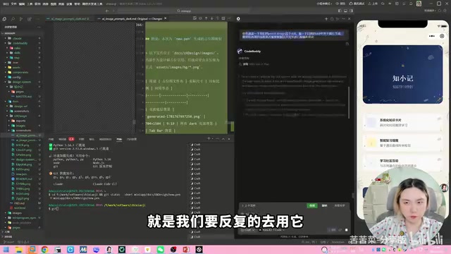
In practice, the CodeBuddy plugin (Tencent Cloud's coding assistant) built into the WeChat Developer Tools was used, with the Gemini 2.5 model selected for the color generation task. CodeBuddy is Tencent Cloud's AI programming assistant, deeply integrated into WeChat Developer Tools, supporting code completion, conversational programming, code review, and more, with the ability to connect to various large language models. Gemini 2.5 is a reasoning model released by Google DeepMind that excels in code generation and multimodal understanding. Its ultra-long context window (supporting 1 million tokens) makes it particularly well-suited for complex tasks involving large amounts of contextual information like design system documents and color specifications.
After feeding the design system document as context, the AI generated three dark color schemes in one go. Compared to the traditional approach where designers manually adjust colors — tweaking hue, brightness, and saturation one by one, repeatedly verifying contrast ratios against WCAG accessibility standards across different components — the AI approach completes the entire color calculation in seconds while automatically considering text-to-background contrast ratios, improving efficiency by an order of magnitude.
The three schemes didn't differ much in overall tone, but the card color details varied. Scheme B was ultimately chosen — a dark color scheme with brown tones that better evokes a bookish feel, consistent with the hand-drawn design language.
Once the scheme was finalized, the AI was asked to generate a complete dark mode Design System page following Pencil MCP's Scale specification, including all color swatches, controls, and button styles.
Common Issues with Background Asset Generation and Processing
Generating the color scheme is just the first step. The real challenge lies in generating and processing background assets. Dark mode also needs hand-drawn textured background images rather than simple solid color fills.
Regarding why AI text-to-image tools cannot directly generate transparent backgrounds — this is determined by the technical architecture of current mainstream image generation models. Whether it's Stable Diffusion, DALL-E, or Midjourney, their training data consists almost entirely of opaque RGB three-channel images, and the models lack the ability to output an Alpha channel (transparency information) during generation. Therefore, generating PNG images with transparent backgrounds requires two steps: first generate an image with a solid color background, then remove the background using matting algorithms (such as deep learning-based semantic segmentation models like SAM, or traditional chroma keying algorithms). Pencil's built-in background removal tool encapsulates this kind of AI matting capability, allowing designers to complete the processing without switching to external tools like Photoshop.
Here are several key considerations:
- Background assets must be generated using Pencil's built-in text-to-image feature
- AI text-to-image cannot directly generate transparent background images — you need to generate with a solid background first, then remove it
- Decorative icons need their backgrounds removed, which can be done directly using Pencil's background removal tool
- AI-generated image quality varies — repeated generation attempts and prompt tuning are needed
Continuously Optimizing MCP Scale Prompt Templates
An important methodology from the course is: Scale (prompt templates) need to be used repeatedly, tested across different scenarios, and continuously improved. During this hands-on session, the AI automatically identified several workflow pain points and offered optimization suggestions, including decoration placement strategies, avatar handling, repeating texture generation, and batch replacement workflows. These optimizations were fed back into the Scale, making it more efficient for future projects.
How well a Scale works depends on how many scenarios you've validated it in. If it doesn't seem to work well, it might also be a model capability issue — try switching to a more powerful model.
Code Refactoring: Implementing Theme Switching Logic
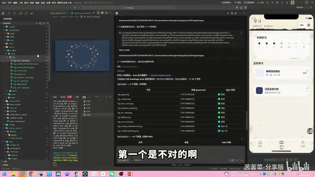
Reorganizing Resource Files by Theme
Before writing any code, the resource file structure needs to be reorganized. Originally, all images were placed under assets/images/. Now they need to be split by theme:
assets/
  images/
    light/    # Light mode exclusive assets
    dark/     # Dark mode exclusive assets
    icon/     # Shared icons (used by both themes)
Light mode background images are moved into the light/ folder, and dark mode assets exported from the design files go into the dark/ folder. Icon assets are shared between both themes and don't need to be duplicated.
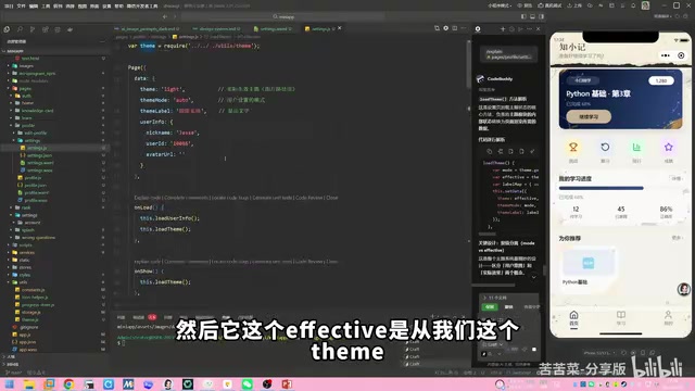
Core Architecture: The Theme.js Utility Class
The core of the entire theme switching system is a theme.js utility module responsible for three things:
- Listening for system dark mode: Calling
getSystemInfoSyncto get the system's current theme - Managing theme state: Supporting three modes —
auto,light, anddark— whereautofollows the system - Applying the theme: Injecting theme variables into the page via
setData, triggering CSS variable and resource path switching
Here, wx.getSystemInfoSync() is a synchronous API provided by WeChat Mini Programs. The returned object includes a theme field with a value of "light" or "dark", reflecting the appearance mode the user has selected in their phone's system settings. Note that this API behaves slightly differently on iOS and Android: iOS has supported system-level dark mode since version 13.0, while Android has supported it since 10.0 (API 29), though some manufacturer-customized ROMs may have offered it earlier. Additionally, WeChat provides the wx.onThemeChange listener event — when the user toggles dark mode in system settings, the mini program receives a real-time notification and can automatically switch themes without requiring a restart.
Initialize the theme in app.js's onLaunch:
const theme = require('./utils/theme.js')

App({
  onLaunch() {
    theme.init(this)  // Initialize theme, passing in the app object
    // Other initialization logic...
  }
})
User-selected theme preferences are persisted via Storage and automatically loaded on the next launch. WeChat Mini Program's Storage is a key-value based local storage mechanism with a 1MB limit per key and a 10MB total limit. Similar to localStorage on the web, data is persistently saved on the user's device and won't be lost even if the mini program is closed or WeChat is exited — it's only cleared when the user actively deletes the mini program or clears the cache. For lightweight configuration data like theme preferences, Storage is the most appropriate persistence solution.
Dynamic Resource Path Loading in WXML
Theme switching involves not only WXSS styles but also dynamically switching image resource paths in WXML. This is achieved through variable interpolation:
<image src="/assets/images/{{theme}}/background.png" />
The theme variable's value is either light or dark, computed by the loadTheme method in theme.js. When the theme switches, setData updates the theme value, and all image paths referencing this variable in WXML are automatically updated, achieving seamless background image switching.
The mechanism behind this is the data-driven view update under WeChat Mini Program's dual-thread architecture. The mini program's logic layer (JavaScript) and rendering layer (WebView) run in separate threads. When the logic layer calls setData, the changed data is serialized and transmitted through the WeChat client's Native layer to the rendering layer. The rendering layer then performs a virtual DOM diff algorithm upon receiving the new data, calculates the minimal DOM update operations, and applies them. Therefore, a single call to setData({theme: 'dark'}) can trigger simultaneous updates for all nodes bound to {{theme}} on the page. However, note that the larger the data payload in setData, the longer the cross-thread communication takes, so avoid passing unnecessarily large data in setData. Theme switching only passes a single string variable, so the performance overhead is negligible.
Theme Switching Interaction on the Settings Page
On the "Me" → "Settings" page, a Trigger control is provided for theme switching with three options:
- Auto: Follow the system's dark mode setting
- Light: Force light theme
- Dark: Force dark theme
When Auto is selected, the mini program listens to WeChat's onThemeChange event and automatically responds when the system switches to dark mode.
Practical Tips for AI-Assisted Development
The entire code refactoring was completed using the Gemini 2.5 model in CodeBuddy, taking about half an hour. A few noteworthy tips:
- Commit code in stages: Makes it easy to roll back if issues arise — the AI proactively suggested this as well
- Long conversation context management: Gemini 2.5 recognizes that long conversations may lead to context loss and proactively suggests saving detailed plans
- Page-by-page adaptation verification: Check the results after adapting each page to ensure the default light mode isn't affected
- CodeBuddy's Memory feature: Enable the memory function to avoid repeatedly providing background information
Conclusion
This hands-on project comprehensively covers the entire workflow of mini program dark mode from design to development:
- Design phase: Leveraging Pencil MCP + AI large models to generate dark color schemes, standardizing the design process through Scale templates
- Asset phase: AI text-to-image generation for dark-style backgrounds, background removal for decorative elements, and theme-based resource file reorganization
- Development phase: Building the Theme.js utility class, unified color management via CSS variables, and dynamic path switching for image resources in WXML
- System integration: Calling WeChat APIs to listen for system dark mode, enabling intelligent auto-following
There are still some visual details that need polishing — for example, some AI-generated background images have border issues, and certain icons display abnormally. These are asset quality issues that need to be gradually optimized. But the overall theme switching architecture is complete and functional, which is the typical rhythm of AI-assisted development — get the main workflow running first, then polish the details incrementally.
Related articles

Stop Writing Prompts by Hand: Let AI Agents Prompt Themselves
Deep dive into the AI coding paradigm shift: from hand-crafted prompts to self-prompting agent loops. Learn how agent self-review and proactive context fetching enable scalable, high-quality AI coding.

Behind SpaceX's Acquisition of Cursor: Musk's True $60 Billion Ambition
SpaceX acquires Cursor parent Anysphere in a $60B all-stock deal. Musk's real play: an AI-driven software production line and invaluable real workflow data.
Cursor in Action: Building a Library Management System in 15 Minutes — Full Walkthrough
Full walkthrough of building a FastAPI + Vue3 library management system in 15 minutes with Cursor AI, covering structured prompts, Plan & Build strategy, and bug fixes.