Pure CSS Scroll-Driven Animations: No JavaScript Required
Implement elegant scroll fade animations using only CSS with animation-timeline and view().
CSS Scroll-driven Animations let you create scroll-based fade-in/fade-out effects without any JavaScript. Using animation-timeline with the view() function, animations are driven by scroll position instead of time, running on the compositor thread for optimal performance. Combined with animation-range for fine-tuned control, this technique is ideal for subtle decorative effects with built-in graceful degradation.
In modern web development, scroll animations are a common way to enhance user experience, but traditional implementations often rely on JavaScript's Intersection Observer or third-party libraries. The Intersection Observer API is a browser-provided mechanism for asynchronously observing changes in the intersection of a target element with the viewport. Before it existed, developers typically relied on listening to scroll events and calculating element positions frame by frame in callbacks—an approach that triggers frequent layout calculations on the main thread, causing serious performance issues. While Intersection Observer significantly reduced overhead by pushing detection down to the browser level, it still required writing JavaScript to register observers and handle callbacks. Third-party libraries like AOS, ScrollMagic, and GSAP ScrollTrigger offer more convenient declarative configurations but introduce additional bundle size and runtime overhead.
Now, CSS-native Scroll-driven Animations allow us to ditch JS entirely and achieve elegant scroll-based fade-in/fade-out effects using only CSS. The core advantage of this technology is that the browser can handle the binding between animations and scrolling directly on the Compositor Thread, completely bypassing the main thread and fundamentally eliminating the performance bottleneck caused by JavaScript involvement. Renowned front-end educator Kevin Powell recently shared a real-world case study from his CSS Demystified course landing page—let's take a deep dive into this technology.
Scroll Fade-In/Fade-Out Effect Showcase
On Kevin's course landing page, there's an ordered list displaying course modules, with each list item preceded by a decorative number. As users scroll down the page, these numbers gradually appear as they enter the viewport, reach maximum visibility around the middle of the viewport, and then fade out again as they approach the top. The entire effect is very subtle and doesn't interrupt the user's reading flow.
There's a key design principle here: Good scroll animations should be subtle, not flashy. Kevin deliberately kept the maximum opacity at 0.2 rather than 1, because these numbers are purely decorative elements and shouldn't steal the spotlight.

Technical Foundation: CSS Counters and Pseudo-Elements
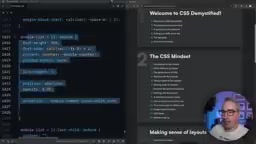
Before implementing the animation, it's important to understand how the numbers are rendered. Kevin uses an HTML ordered list (<ol>), but native list number styling is limited and can't meet decorative needs. So he uses CSS pseudo-elements (::before) combined with CSS Counters to customize the number display.
CSS Counters are a feature introduced in the CSS 2.1 specification that allows developers to maintain and increment numeric variables at the pure CSS level. They work based on three core properties: counter-reset initializes a counter on an element and sets its starting value; counter-increment increments the counter's value on each matching element; and the counter() or counters() function reads and outputs the current count value within the content property. In ordered list scenarios, browsers use the built-in list-item counter by default to generate list numbers, but its styling is limited to the preset formats provided by the list-style-type property. By hiding the native list markers (list-style: none) and using the counter() function in the ::before pseudo-element's content, developers can fully customize the font, size, color, positioning, and other visual properties of the numbers, achieving decorative effects far beyond native list marker capabilities.
There's an accessibility detail worth noting here: since the original ordered list already has semantic numbering, the numbers in the pseudo-elements are purely decorative. To prevent screen readers from reading the numbers twice, appropriate alt text should be set in the content property to indicate these numbers are for decoration only.
Core Implementation: animation-timeline and the view() Function
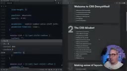
Defining Keyframe Animations
First, define a simple keyframe animation. In Kevin's implementation, the element's default opacity is set to a very low value (e.g., 0.05), and the peak opacity is reached at the 50% mark of the animation:
@keyframes color-shift {
  50% {
    opacity: 0.2;
  }
}
This means the animation starts at low opacity, reaches its maximum at the midpoint, then falls back—creating a natural fade-in/fade-out curve.
Binding Scroll Timeline with animation-timeline
Traditional CSS animations use time as the driver (animation-duration), but the key to scroll-driven animations is replacing time with scroll position. This is achieved through the animation-timeline property:
.list-item::before {
  animation: color-shift;
  animation-timeline: view();
}
The animation-timeline property comes from the W3C Scroll-driven Animations specification, which defines two types of scroll timelines: Scroll Progress Timeline and View Progress Timeline. The scroll() function creates a scroll progress timeline that maps animation progress to the overall scroll offset of a scroll container—progress is 0% when the container is scrolled to the top and 100% when scrolled to the bottom. The view() function creates a view progress timeline that tracks the visibility changes of a specific element within the scrollport of its nearest scrolling ancestor. The view() function can also accept parameters to specify the observation axis (block or inline) and inset adjustments.
In this specific case, the view() function binds animation progress to the element's visibility within the viewport. When the element first enters the bottom of the viewport, animation progress is 0%; when it completely exits through the top, progress is 100%. At the 50% mark (roughly the middle of the viewport), the element reaches maximum opacity. This mechanism of binding animation progress to scroll position essentially replaces the traditional time-based animation timeline with a spatial position-based one, making the animation entirely driven by the user's scrolling behavior without any JavaScript timers or event listeners.
Fine-Tuning Animation Range with animation-range
animation-range is a shorthand property in the Scroll-driven Animations specification for fine-tuning the active interval of an animation on its timeline. It combines animation-range-start and animation-range-end. For view() timelines, the specification defines several named ranges: cover (from when the element starts entering to when it completely leaves), contain (from when the element is fully visible to when it starts leaving), entry (from starting to enter to fully entered), exit (from starting to leave to fully left), and more. Developers can use these named ranges with percentages to precisely specify animation start and end points. The Chrome team also provides a DevTools extension called Scroll-driven Animations Debugger that visualizes these range boundaries, greatly facilitating debugging.
Delaying Animation Start with animation-range-start
By default, the animation begins as soon as the element enters the viewport, but this can make the effect less noticeable. You can delay the animation's starting point with animation-range-start:
animation-range-start: 20%;
This means that after the element enters the viewport, the fade-in won't begin until scrolling reaches the 20% position. Before that, the element maintains its initial low-opacity state.
Extending the Animation End Point with animation-range-end
One issue Kevin encountered was that elements faded out too quickly as they approached the top of the viewport. He wanted elements to fully disappear only when they were about to leave the viewport. The solution was to set animation-range-end beyond 100%:
animation-range-end: 120%;
Pushing the end point to 120% beyond the viewport means the second half of the animation (the fade-out portion) gets stretched. The element maintains higher visibility while within the viewport and only fades out quickly as it nears complete exit. When using values above 100%, you're essentially pushing the animation's logical endpoint to a virtual position beyond where the element physically leaves the viewport, thereby stretching the time distribution of the animation's second half and making the fade-out more gradual and natural.
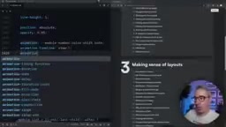
Adjusting Keyframe Percentage Distribution
Besides using animation-range, you can also directly adjust keyframe percentages to control the effect. For example, changing the peak from 50% to a range of 20%-80%:
@keyframes color-shift {
  20% { opacity: 0.2; }
  80% { opacity: 0.2; }
}
This way, the element quickly reaches peak opacity at 20%, maintains it until 80%, and only then begins to fade out. Both approaches have their pros and cons—the animation-range method is more flexible since it doesn't require modifying the keyframes themselves.
Design Philosophy: Restraint Is the Best Scroll Animation
Kevin repeatedly emphasized an important point throughout the video: The best practice for scroll-driven animations is restraint. He believes that text constantly fading in on scroll "can be super annoying," and that applying animations to decorative elements with subtle variation ranges is the better choice.
This is why he ultimately chose 0.2 rather than 1 as the maximum opacity—the entire effect is just a subtle, barely-there change. Users might not consciously notice it, but it genuinely adds a layer of refined polish to the page.
Browser Compatibility and Practical Advice
Scroll-driven animations are a relatively new CSS feature. They currently have good support in Chrome and Edge (enabled by default since Chrome 115+), and Firefox is actively catching up. Safari doesn't support them yet, but the WebKit team has expressed a positive stance toward the specification. For unsupported browsers, the animation portion is simply ignored and elements display with their default styles—this is inherently graceful degradation, and one of the natural advantages of a pure CSS approach over JavaScript: no extra fallback logic needed.
If you want to use this technology in your projects, here are some recommendations worth considering:
- Start with decorative elements: Don't use scroll animations on core content to avoid affecting readability
- Keep effects subtle: Keep opacity changes within a small range; avoid large-scale translations or scaling
- Make good use of animation-range: Precisely control when animations trigger and end to polish the detailed experience
- Mind accessibility: Ensure decorative content has proper alt text, and respect users'
prefers-reduced-motionpreference settings.prefers-reduced-motionis a CSS media query feature that detects whether a user has requested reduced animation effects at the operating system level (such as macOS's "Reduce motion" or Windows' "Show animations" settings). For people with vestibular disorders, on-screen animations can trigger dizziness, nausea, or even migraines. WCAG 2.1 guideline 2.3.3 recommends providing a mechanism to disable non-essential animations. In practice, developers should use@media (prefers-reduced-motion: reduce)to remove or significantly simplify animation effects—for example, replacing scroll-driven animations with a static final-state display. It's worth noting that "reduced motion" doesn't mean "no motion at all"—appropriate fade transitions are generally acceptable, but large-scale translations, scaling, and parallax effects should be removed.
The emergence of pure CSS scroll-driven animations allows front-end developers to breathe life into pages without adding any JavaScript overhead. The key is—use them in the right places, and use them with restraint.
Related articles
Sakana AI Launches RSI Lab: The Path to Recursive Self-Improvement Where AI Builds AI
Sakana AI launches RSI Lab for recursive self-improvement, letting AI autonomously improve its own architecture. Explore their four-stage roadmap and key breakthroughs.

The Clotilda: Underwater Archaeological Discovery of America's Last Slave Ship
The Clotilda, America's last slave ship, was discovered by underwater archaeologists in Alabama nearly 160 years after sinking. Learn about the search, key evidence, and other slave trade shipwreck discoveries.
Sakana AI in Practice: Reshaping Banking Lending Operations with AI Agents — Technology and Strategy
Deep dive into how Sakana AI applies AI Agents to banking lending operations, covering end-to-end support from information gathering to approval document generation, plus technical challenges and human-AI collaboration design.